UESPWiki:Featured Images/Past Nominations/Archive 3
| This is an archive of past UESPWiki:Featured Images/Past Nominations discussions. Do not edit the contents of this page, except for maintenance such as updating links. |
This is an archive of past nominations for Feature Images from November 2012 to June 2013.
Contents
- 1 File:MW-place-Nchuleftingth.jpg
- 2 File:SR-place-River Yorgrim.jpg
- 3 File:SR-place-Volskygge_03.jpg
- 4 File:RG-creature-Dolphin.jpg
- 5 File:OB-quest-Peryite.jpg
- 6 File:SR-place-Bonestrewn Crest.jpg
- 7 File:SR-creature-Frost Atronach.jpg
- 8 File:OB-creature-Wolf.jpg
- 9 File:SI-Gatekeeper Ritual.jpg
- 10 File:SI-quest-A Door in Niben Bay.jpg
- 11 File:SI-creature-Grummite (Mania).jpg
- 12 File:OB-creature-Umaril the Unfeathered.jpg
- 13 File:SI-npc-Knight of Order.jpg
- 14 File:SR-npc-Ancano 09.jpg
- 15 File:OB-creature-Imp.jpg
- 16 File:SR-creature-Odahviing 02.jpg
- 17 File:OB-quest-Azani Blackheart 3.jpg
- 18 File:SR-creature-Sabre_Cat.jpg
- 19 File:SR-quest-The Cursed Tribe 02.jpg
- 20 File:SR-quest-Coated in Blood.jpg
- 21 File:DB-quest-The Chief of Thirsk Hall.jpg
- 22 File:SR-creature-Werewolf 02.jpg
- 23 File:SR-place-Shrine of Azura 02.jpg
- 24 File:SR-creature-Grok.jpg
- 25 File:SI-place-Mania.jpg
- 26 File:SR-creature-Pack Member 02.jpg
File:MW-place-Nchuleftingth.jpg

Even if I don't play it, MW should get more spotlight, and I think this image will do it justice. It shows the cool quirkiness of Dwemer architecture, even in thumbnail, plus the contrast between the sky and the buildings is quite eye-catching.
- Support: As nominator. --Quill-Tail (talk) 11:29, 18 June 2013 (GMT)
- Support: Its been too long since such an easy support was able to be given. Silence is GoldenBreak the Silence 11:39, 18 June 2013 (GMT)
- Support:Very eye-catching --AN|L (talk) 15:36, 18 June 2013 (GMT)
- Support: A pretty, well-thought-out shot. I like it! ⇠eshetalk 15:48, 18 June 2013 (GMT)
- Support: I'm a real sucker for anything Morrowind, and it's been quite awhile since we've had a Morrowind FI. I especially like how the fog doesn't really detract at all. --HalfStache 16:34, 18 June 2013 (GMT)
- Support: Great image! Definitely worthy of FI status. Forfeit (talk) 17:43, 18 June 2013 (GMT)
- Full Support: nice contrast. For mw it has nice whether.--Tiberseptim2 (talk) 19:11, 18 June 2013 (GMT)
File:SR-place-River Yorgrim.jpg

Stumbled across this landscape shot. It has good depth, and captures the image subject pretty well. It also makes for an interesting thumbnail.
- Support: As nominator. —Legoless (talk) 19:07, 17 June 2013 (GMT)
- Oppose: Same problem as above, the colours are super bleak. I realize this is often the case in Skyrim, but that colour scheme doesn't make for exciting screenshots. Also, this scenery is short on wow. Weroj (talk) 19:42, 17 June 2013 (GMT)
- Support: It's a very nice shot of the river. The closest waterfall, in particular, looks very nice. I also agree that it's an interesting thumbnail. Forfeit (talk) 20:02, 17 June 2013 (GMT)
- Neutral:not bad and not great. Skyrim lacks color and vibrance. The texture is brilliant but the dullness Is the main downside.--Tiberseptim2 (talk) 04:30, 18 June 2013 (GMT)
- Neutral:Not horrible but there's nothing really interesting about it. The colors are bleak and it's hardly a unique or interesting landscape. --AN|L (talk) 15:36, 18 June 2013 (GMT)
- Oppose: To be honest, I find the angle on this one nauseating. Maybe I'm crazy, but I like the previous version better. ⇠eshetalk 15:48, 18 June 2013 (GMT)
- Oppose: I have to agree that this image, while there is nothing that stands out as bad, is just too bland and colorless to be an FI. --HalfStache 16:31, 18 June 2013 (GMT)
File:SR-place-Volskygge_03.jpg

While taking a look through Recent Changes, I stumbled across the page with this picture. I have to say, it feels pretty epic. Definitely worth an attempted nomination.
- Support as nominator. --Nocte|Chat|Look 00:57, 16 June 2013 (GMT)
- Support: I'm obligated to lend an image of a Dragon Priest breaking wind my full support. Minor EditsThreats•Evidence 01:04, 16 June 2013 (GMT)
- Neutral: There's definitely a lot that's great about this picture. I mean, look at that bowl of fire, look at that nice pose, and look at the nice snow on the upper half of the wall. On the other hand, the lower half of the dragon priest seems a bit strange, the snow effects on the lower half of the wall aren't so good, and then there's the fact that I had no idea what the heck this image was by looking at the thumb. So, some good some bad. Feel free to change my mind. --HalfStache 03:43, 16 June 2013 (GMT)
- Opposed: While undoubtedly a good picture for what it is, I just don't like it enough for it to be featured. The object in this image are far too asymmetrical for my tastes. Also, the image is far too dark. --AKB Talk Cont Mail 20:27, 16 June 2013 (GMT)
- Oppose: Just a dragon priest bursting from his coffin. Nothing special. —Legoless (talk) 00:51, 17 June 2013 (GMT)
- Oppose:Nice But not for FI. Sadly it's too dark but Dragon Priests are awesome. Perhaps find another DP.--Tiberseptim2 (talk) 04:56, 17 June 2013 (GMT)
- Support: This is a great image, and is obviously good enough to be used on three pages. Other than that, it has that rare quality that it works as a thumb – but also makes it interesting to click on the thumb to take a closer look at the image itself. Definitely supported. --Krusty (talk) 06:40, 17 June 2013 (GMT)
- Oppose: It's a nice looking image, but my quibble is that you cannot tell what exactly is going on here, particularly if you aren't familiar with Skyrim already. --AN|L (talk) 15:31, 17 June 2013 (GMT)
- Oppose: I simply don't think it's impressive enough for FI status, either as a thumbnail or full size. — ABCface◥ 15:36, 17 June 2013 (GMT)
- Oppose: I don't like the fog, nor the bleak colours. Weroj (talk) 19:42, 17 June 2013 (GMT)
- Oppose: I like where this shot was headed, but I think it would have been much more remarkable from a different angle. I wish I could see more of the word wall, and I don't care for the brazier just hanging out in the corner. Better lighting couldn't hurt to liven it up either. ⇠eshetalk 15:48, 18 June 2013 (GMT)
File:RG-creature-Dolphin.jpg

You'd think this is a joke but it's not. How often dor you see a dolphin in the elder scroll? Or how often would you see one jumping with another? Could this be the next FI?
- Support: As nominator. ⇠Tiberseptim2' 4:55, 7 June 2013 (GMT)
- Oppose: This image simply does not do it for me. While dolphins are indeed interesting, this image is really nothing special... I am going to have to say "No" to this one. --Nocte|Chat|Look 05:40, 7 June 2013 (GMT)
- Support: I like it - the composition is great. Of course it can't compete graphically with the new games, but for a screenshot from Redguard, it's very neat. Weroj (talk) 10:01, 7 June 2013 (GMT)
- Oppose: Maybe if we had FIs in 1998, this would be suitable. I believe in cutting some slack for the older games, considering their technical limitations, but this is from a fifteen-year-old game. I don't think there's any FI-worthy screenshots from before Morrowind. Minor EditsThreats•Evidence 16:40, 7 June 2013 (GMT)
- Oppose: If we were viewing the dolphins more from the side I might sing a different tune, but as it stands I can't really get excited about this image. ⇠eshetalk 16:45, 7 June 2013 (GMT)
- Oppose: It's a pretty good image given the age of the game, but there's really nothing too impressive about it. A different angle and perhaps a closer view of the dolphins may have been a different story though. Forfeit (talk) 17:06, 7 June 2013 (GMT)
Oppose: I was debating this one for a bit, but decided that, even considering the age of the game, it's just too unremarkable. --Xyzzy Talk 17:11, 7 June 2013 (GMT)- Neutral: I'm removing my opposition to making this an FI. After reading others' comments and votes, I understand this image's appeal. I still think a better shot of these dolphins is possible (I'm assuming that they are environmental, like the bats in Skyrim), but IMO this is not a valid reason for me to oppose it. --Xyzzy Talk 18:12, 10 June 2013 (GMT)
- Support: Haha, that image is brilliant. I don’t think a featured image needs to be from a recent Elder Scrolls game, nor do I believe for a second that it needs to showcase improved resolution and flashy effects like MW, OB or SR. The Featured Image on the main page is about showing that we cover the entire universe – and that we respect that the older games are… older. In short, this would be a breath of fresh air on the main page – and provide us with a bit of coolness on the side. :) --Krusty (talk) 18:49, 7 June 2013 (GMT)
- Support: I agree with Krusty. Almost all of our FIs are of SR, OB, and MW, but we cover a universe of a dozen games, and these "lesser" games deserve some exposure. The most unique thing about this picture is "holy crap, there are dolphins" - that's definitely a unique quality. Featured Images showcase what we as a site value, and we as a site definitely value our complete coverage of even the most obscure parts of the Elder Scrolls universe, so I find it fitting to feature this image. • JAT 21:48, 7 June 2013 (GMT)
- Support:This was a tough one for me and required some thinking, but I think I'm going to support this image. There's several factors that went into this: The fact that it's from 1998, the uniqueness of the image, the quality of the image, etc, but it really comes down to the quality of the image. In the end, it really is a good image. Some are saying that it can't be good because it is so old, but really, it is a good image for 1998: It's not super pixelated (a little, yes) and there's some distance fading like in Morrowind (if anyone knows what I mean lol). With all that being said, just because it is different (from Redguard, involves dolphins) doesn't mean it is FI worthy. Sure, it makes it cool, but that shouldn't be the only reason.--WoahBro (talk) 22:15, 8 June 2013 (GMT)
- Support: Per Krusty and Jak.--Maroonroar (talk) 15:49, 10 June 2013 (GMT)
- Oppose: Just because it's old doesn't mean it can't get any better than this. I've taken a look at Redguard images and there's plenty of better ones than this one (about any other one really). Apart from a pixelated oddity, this image is completely bland ~ Dwarfmp (talk) 17:03, 10 June 2013 (GMT)
- Oppose: It's not that I wouldn't support an older image, but... The angle is not the best (the left dolphin could also be an penguin if ignored the fact that he would be standing mid-air), the background is a bit too bleached, and the resolution is pretty small... There's still potential in an dolphin creature shot. -- SarthesArai Talk 17:49, 10 June 2013 (GMT)
-
- Comment: I will admit that dolphins in an Elder Scrolls game are really cool. I will also admit that it would be awesome to have an FI from an older game such as Redguard. I can even agree with Krusty that an FI does not need to demonstrate flashy effects. However, this image just does not cut it for me. And I have to agree with everything Sarthes said. The background is very whitewashed, and the resolution is small (which, in and of itself is not necessarily an issue, but taken with everything else...). --Nocte|Chat|Look 19:10, 10 June 2013 (GMT)
Support: I most definitely want this one featured. For what it is, it's great. It would also mark it as the screenshot from the oldest game on the site. I think the front page would look great with a shot of a tropical locale, and I can't think of anything better than dolphins with palm trees in the background on a sandy beach for that.--AKB Talk Cont Mail Cont Mail 18:00, 10 June 2013 (GMT)- Oppose:If it's not ours, then I don't want it featured. I would also like to formalize a rule against using other site's images. After all, this is supposed to be our featured images, not just miscellaneous ES images (see talk page for topic on this). --AKB Talk Cont Mail Cont Mail 00:17, 11 June 2013 (GMT)
- Oppose: I've been lurking on this vote for awhile, not really sure one way or another, but Dwarfmp inspired me to actually compare this to other Redguard images. Overall, I found 3 (4 actually, but one has a watermark) that I found to be better images overall than this (this, this, and this). I feel that the low resolution, combined with the relative blandness of the dolphins themselves, and the availability of alternatives makes this particular image not FI worthy. --HalfStache 21:45, 10 June 2013 (GMT)
- Comment: This isn't an image unique to UESP; I took it from a filesharing website. For that reason, I don't really think that it can or should be featured. —Legoless (talk) 22:49, 10 June 2013 (GMT)
- Oppose: I wasn't planning on voting on this image, but given the information Legoless shared about how it came to UESP, I feel obliged to oppose it. — ABCface◥ 23:10, 10 June 2013 (GMT)
- Oppose: Just to bring the numbers up, and because it's not a UESP image. Silence is GoldenBreak the Silence 00:32, 11 June 2013 (GMT)
CONSENSUS: NONE. Image turned out to be taken from another site, so is not FI-material. --Krusty (talk) 04:36, 11 June 2013 (GMT)
File:OB-quest-Peryite.jpg

Just stumbled across this one today—it's a lovely shot for Oblivion, and I love the angle and the effect of the moonlight. The moons in the background are very cool, and even the detail on the trees is excellent.
- Support: As nominator. ⇠eshetalk 17:46, 29 May 2013 (GMT)
- Support: Lighting is excellent for a night shot. The moons and foliage make for a nice background. —Legoless (talk) 19:09, 29 May 2013 (GMT)
- Support: Very nice shot! --Xyzzy Talk 23:36, 29 May 2013 (GMT)
- Support: There seems to be some blurring on a few spots of the statue, but everything else is great. The sky and moons are amazing, the trees look great, and the overall camera angle is fantastic. --HalfStache 01:52, 30 May 2013 (GMT)
- Support: Me likey. • JAT 03:53, 30 May 2013 (GMT)
- Support: Awesome lighting and background, and a wonderful shot as a whole. --Quill-Tail (talk) 15:25, 30 May 2013 (GMT)
CommentSupport: The background is gorgeous. The moons behind the trees is a stunning shot. But I am refraining from casting a vote because there is one thing that baffles me here, and I did not really notice it until I looked at the image full-screen. Where is the light on the statue coming from? In my experience, the moon is the only source of light in the night-time sky, but the light on the statue does not look like it is coming from the moon. So where is the light coming from? --Nocte|Chat|Look 17:56, 30 May 2013 (GMT)
- Support: I like it. The tail's a bit unfocused in front, but I don't think that takes away from the image much. It looks very nice wherever the light is coming from. Vely►t►e 19:20, 30 May 2013 (GMT)
- Support:Yes! That's what I'm after! user:Tiberseptim2 04:12, 31 May 2013
- Support: Yep, definitely FI-worthy. Fantastic shot. — ABCface◥ 02:27, 1 June 2013 (GMT)
- Support: Very nice image, especially for a night shot! The statue and the background both look great. Forfeit (talk) 17:06, 7 June 2013 (GMT)
File:SR-place-Bonestrewn Crest.jpg

While browsing Images, I came across this one and thought "Wow". A Landscape shrouded by a almost mystical fog with a dragon emerging from it in the background, and a great distance view at the left side. Definetly worth FI!
- Support as nominator. SarthesArai (talk) 17:31, 21 May 2013 (GMT)
- Support: Yes, it's very good. Almost like a painting. Weroj (talk) 17:53, 21 May 2013 (GMT)
- Support: I like it. The thick fog on the right side of the picture adds a certain depth to it, and the landscape is very interesting. The landscape is very brown, but it goes well with the bluish-green mountains and white fog. The mountains in the distance and the dragon are nice touches. • JAT 18:23, 21 May 2013 (GMT)
- Support: The dragon appearing out of the fog does it for me. That and the angle, which I don't think could have been better captured. --Vulpa 00:30, 22 May 2013 (GMT)
- Support: Not a fan of some of the angling at the bottom of the image (the path leading up to the area), but everything else is amazing. Great background, nice view of the Word Wall, and that fog with the dragon is simply brilliant. --HalfStache 00:35, 22 May 2013 (GMT)
- Support:I would of opposed this were it not a dragon lair. It would just be too distracting otherwise, having a dragon flying about. But this really works. I am in love with this composition. If I had to complain, the colors seem to be a bit muted, the dragon doesn't stand out as much as you'd think it would. --AKB Talk Cont Mail 00:43, 22 May 2013 (GMT)
- Oppose:I don't get it. It's a good image but it isn't focusing on anything in particular. Just because it's Skyrim it seems like it's accepted. Why not Morrowing?Tiberseptim2 00:01, 24 May 2013 (GMT)
-
- Comment: If you look at UESPWiki:Featured Images/Old FIs, you'll see that we did feature some of morrowind's screenshots, as well as several from oblivion since skyrim's release. If you come across any image that's worth being featured on the main page, you may nominate it. It's voted upon the image and its content, not the game it came from. -- SarthesArai Talk 16:30, 29 May 2013 (GMT)
File:SR-creature-Frost Atronach.jpg

Well I was eating my pizza and I was surfing the wiki...yeah - enough about how I came across this particular image. But as soon as I saw it, I stopped and thought that the overall composition and framing of it is stupendous in my eyes and visually eye catching. I love how the "wisps" of ice cold air seem to radiate off of the Frost Atronach and reflects also upon the climate that this shot was taken in. Plus the simplicity of the shot overall makes it stand-out :)
- Support: As nominator. -helenaanne talk ♥ 23:25, 8 May 2013 (GMT)
- Support: Wow. The sunlight streaming through its aura from behind looks really cool. --Xyzzy Talk 00:29, 9 May 2013 (GMT)
- Oppose: When I saw this being nominated, I looked at the thumb and thought "holy **** that looks amazing". I then blew up the image to full scale to get a better look, and my excitement quickly faded away. First off, I want to say that the Atronach itself is pretty well done. The only thing about it is the way that the lights interact with the legs in particular to make the shadowing on the creature look very inconsistent. The biggest thing in my opposition is actually the background. The long shot and the closer trees are nice, but look at the mountains that it is standing on. There's so much texture stretching it almost hurts my eyes, and I think that we do not need to put graphical missteps like that on the front page. --HalfStache 04:47, 9 May 2013 (GMT)
- Slight Oppose: I agree and all when you say the background but considering that it's frost atronach, there's not enough contrast (however, it does look appealing). Perhaps change the atronach or find one with a little green in the background. Just my opinion by the way. Nice work though! --Tiberseptim2 16:58, 9 May 2013 (GMT)
-
- Comment: Unfortunately that is the downside to the in-game graphical aspects of some parts of Skyrim. Without serious modification in-game and to the image, we can't really do much except for taking it in a different location -- which in itself may either allow the Frost Atronach to stand out further, or diminish the image and actually harm it rather than improving it. Either way, there's nothing we can really do to improve the in-game graphics as we have to provide images exactly as you would encounter them in-game. -helenaanne talk ♥ 05:08, 9 May 2013 (GMT)
- Comment: I've said this many times before, but we shouldn't look over some graphical flaw in an image just because "it's part of the game". There are plenty of great images which hide issues or sneak around them, and those are the ones that (if they look great in other ways too) we should feature. --HalfStache 05:15, 9 May 2013 (GMT)
- Comment: That is why, if you read the entire comment, I suggested that if it were to be taken in a different setting that were highly effective -- yet hid any of the in-game flaws that Skyrim has, that that aspect of which you are mainly opposing for, could then be overlooked. -helenaanne talk ♥ 05:38, 9 May 2013 (GMT)
- Comment: I've said this many times before, but we shouldn't look over some graphical flaw in an image just because "it's part of the game". There are plenty of great images which hide issues or sneak around them, and those are the ones that (if they look great in other ways too) we should feature. --HalfStache 05:15, 9 May 2013 (GMT)
- Comment: Unfortunately that is the downside to the in-game graphical aspects of some parts of Skyrim. Without serious modification in-game and to the image, we can't really do much except for taking it in a different location -- which in itself may either allow the Frost Atronach to stand out further, or diminish the image and actually harm it rather than improving it. Either way, there's nothing we can really do to improve the in-game graphics as we have to provide images exactly as you would encounter them in-game. -helenaanne talk ♥ 05:08, 9 May 2013 (GMT)
- Slight Support: The image itself is not really groundbreaking or "special", but I do like the details and how solid the atronach looks. --Quill-Tail (talk) 06:26, 9 May 2013 (GMT)
-
- Comment: I know it's not overly extravagant in anyways. That's what I like most about it when I nominated the image. I liked the simplicity - heck I'm even known to love simple things as well. Plus generally in more extravagant and detailed images, sometimes certain aspects tend to be overlooked or lost within the image from my personal experience. -helenaanne talk ♥ 06:38, 9 May 2013 (GMT)
- Support: The stretchiness of the ground on this image has long bothered me. I've been vacillating back and forth on the nomination, but the fact is my first thought whenever I look at it is "freaking awesome". Gotta go with my gut. Side note: you can't cut your votes in half. "Slight" means nothing. You're either for it or you're not. Minor EditsThreats•Evidence 06:47, 9 May 2013 (GMT)
- Support and Suggestion: Despite what some are saying about the background, I kinda like the Atronach on the snowy mountain. It almost gives it a 'natural' look (although Atronachs are summoned and therefore don't have a natural habitat, but still...ice and snow and stuff). Plus I've never noticed that icy effect which just looks sick. As for my suggestion: In addition a different setting to make people happy, maybe have it in combat with some cool enemy like, I don't know, an ice wraith? I don't know. Okay, I think I'm done.--WoahBro (talk) 14:27, 11 May 2013 (GMT)
- Support: I hate the way frost atronachs look in Skyrim, but this picture is still cool. The cold radiating from the atronach and the sunshine reflecting on the ice... purrty. Weroj (talk) 12:51, 12 May 2013 (GMT)
- Support: I thought on this a lot, and originally came down as opposing this. However, the lighting and detail has really gotten to me. I fully support this one. --AKB Talk Cont Mail 03:55, 15 May 2013 (GMT)
- Oppose: While this is indeed no bad shot, the pose is rather boring and these shadows on the right leg and arm are rather strange. SarthesArai (talk) 15:52, 15 May 2013 (GMT)
- Option: Would this frosty dude do? File:OB-creature-Frost Atronach.jpg User:Tiberseptim2 8:47 20 May 2013
- Comment: In my opinion, any discussion of that alternate picture should be done in a separate nomination, made after this nomination is closed. --written by Nocte Chat with me?Look at what I did! 09:03, 16 May 2013 (GMT)
-
-
- Comment: Yes, Nocte Canticum is absolutely correct. This is not a chatroom or forum and we don't need to nominate or discuss every single image on the wiki. Also, please wait with further nominations until the current ones are closed - this is getting a bit ridiculous. --Krusty (talk) 10:02, 16 May 2013 (GMT)
-
- Support: I'm definitely saying "yes" to this one. The Frost Atronach's icy effect is just spectacular. • JAT 18:23, 21 May 2013 (GMT)
- Support: I've been debating this for a while, because the only reason I like it so much is the visual effects. Now, while they are gorgeous (particularly the shadow of the ice chunks on him--are there genders? :P--and the curling mistiness that reminds me of dried ice and makes me cold), it's basically the game that made it that way, not the "photographer". Generally, I look at nominations here in two ways: is it visually stunning (the game's contribution) and otherwise striking (up to the player's way of angling/capturing motion/etc). This one met number one with the visuals, but really, it's just a hunk of ice standing there looking stupidly at the camera--blindly, I might add, how does "he" know where to look?! But, really, in this case the effects are enough. Pretty points won the vote. Yes I'm done babbling now, carry on... --Vulpa 00:30, 22 May 2013 (GMT)
File:OB-creature-Wolf.jpg

I've been reading what people have been looking for and while browsing I thought Wow! A great action shot of a wolf in combat. The background and surroundings are satisfying!
- Support as nominator. User:Tiberseptim2 (User_talk:Tiberseptim2) 2:57:13, 18 May 2014 (UTC)
- Question: I was checking the date of this nomination, to see if an admin could call a consensus yet (merely satisfying my curiosity, mind you) and... How did you post this a year in the future? :P --written by Nocte Chat with me?Look at what I did! 17:11, 15 May 2013 (GMT)
Neutral - for now: I think that this is a great image as a whole, and it is on the very edge of neutral. My only two complaints are that it doesn't really have that special something to make it truly amazing, and the wolf's face is kinda odd. However, I think that the rest if the image at the very least makes up for those. My vote stays neutral for now, but I will change it to support unless I see compelling arguments for the opposition. --HalfStache 05:35, 12 May 2013 (GMT)- Support: --HalfStache 05:35, 15 May 2013 (GMT)
- Support: I am thoroughly impressed with this image. I love the pose the wolf has taken, I love the foliage in the background, I love the shadow on the grass. The image comes together quite nicely, and even at full resolution there are no glaring issues. --written by Nocte Chat with me?Look at what I did! 08:35, 12 May 2013 (GMT)
- Support: Haha! This is a great action shot. I laughed upon first seeing it, and the image stands up to close scrutiny, too. Weroj (talk) 12:51, 12 May 2013 (GMT)
- Support: Pretty cool, considering just how hard it is in OB to take decent action shots. Still impressive up close too, and it looks great as a whole image. --Quill-Tail (talk) 14:29, 13 May 2013 (GMT)
- Comment: So now Halfstache, I take a support from you? User:Tiberseptim
- Comment: Well, my opinion of the image has gotten better after seeing all the praise, so yes, I change to support. --HalfStache 05:35, 15 May 2013 (GMT)
- Support: This is just awesome. --AKB Talk Cont Mail 03:55, 15 May 2013 (GMT)
- Support: Amazing action shot! SarthesArai (talk) 15:52, 15 May 2013 (GMT)
File:SI-Gatekeeper Ritual.jpg

This time I'm more sure that this is what we are looking for. A nice angled shot of a npc and the middle of The ritual with light contrasting with the dark. enough said. thanks!
- Support: As nominator. Tiberseptim2 talk 05:12, 6 May 2013 (GMT)
- Oppose: I feel that it lacks a certain pizzazz. It also tends to fall into the trap which I feel many OB images fall into, which is a sort of monotone blandness. Yes, the nice effects are nice, but they really don't do as much as I would like, because they aren't awesome and amazing. The other thing that I don't like about this picture is the way that Relmyna contrasts so much with the rest of the image. Yesyesyes, contrast is great, I know, I get it. But it is NOT great when it forces the focus to something which should not be the main focus. I feel that her mere existance in this image subtracts from the rest of it by distracting from the bigger event going on. --HalfStache 05:27, 6 May 2013 (GMT)
- Neutral: It's a cool moment in the game, but that's a double-edged sword. Each "cool moment" will likely only get enshrined as an FI once, if ever, so when we vote for an image of it, we should be sure it's the best depiction the community can muster. I'm don't know if this image shows off this particular "cool moment" in the best possible way. Minor EditsThreats•Evidence 03:18, 7 May 2013 (GMT)
- Oppose: I'm going to have to say "no" to this one. I'm not keen on the composition as a whole, and I don't think this is the best representation of the event. I'm not opposed to featuring an image of this event, but this image in particular just isn't cutting it for me. • JAT 04:26, 7 May 2013 (GMT)
- Oppose: Unremarkable. Weroj (talk) 06:20, 7 May 2013 (GMT)
- Oppose: Agreed. Unremarkable image of a very cool scene. --Xyzzy Talk 00:29, 9 May 2013 (GMT)
- Neutral: I've been thinking on this one for awhile. I think I've figured that this is a cool moment, but it's just a bunch of blue light...that's about it. If the image was of the flesh atronach emerging from the potion--or whatever that is--then this picture would be 10x cooler and almost guarantee my vote.--WoahBro (talk) 01:04, 9 May 2013 (GMT)
- Oppose: Well, what I have to say about this image is that I remember this scene to be of a blue-violettish color, where this image has a boring greenblueish tone... It definetly could improve much SarthesArai (talk) 11:02, 9 May 2013 (GMT)
File:SI-quest-A Door in Niben Bay.jpg

Dwarf found the perfect angle to show off one of the cooler designs in all the Oblivion content.
- Support: As nominator. Minor EditsThreats•Evidence 06:07, 5 May 2013 (GMT)
- Support: I'm not a big Oblivion fan, but I really like this image. Not much more to say other than to mention that Shivering:A Door in Niben Bay may have all of its images be FI's soon. --HalfStache 16:01, 5 May 2013 (GMT)
- Support: Cool image. --Xyzzy Talk 16:11, 5 May 2013 (GMT)
- Support:Nice image although I would prefer it more if the people weren't in it. --Ad intellige (talk) 16:17, 5 May 2013 (GMT)
- Slight Support: There's nothing phenomenal about this picture, but I do like it. That view is just plain BA. — Unsigned comment by WoahBro (talk • contribs)
- Neutral: I love the angle, lighting, subject, everything! However, if we want this picture to be as good as possible (which it really should be if it's an FI), it should be retaken, exactly like this shot, except with the two NPCs out of the way. • JAT 04:26, 7 May 2013 (GMT)
-
- The NPCs are what makes the image complete, I had to do some work to get that guard to look into the gate. It would've been another easy shot to just remove the NPCs with the console, which would be altering the game, because I'm positive you can't get them out of there naturally. How would this be a quest shot without the quest NPCs? It'd just be another place shot ~ Dwarfmp (talk) 04:56, 7 May 2013 (GMT)
- Oppose: I don't like the two little dudes either. Whenever I look at the face they gnawingly bother me down there. I'm not sure if it would be better with different positioning... For the record, they did both somehow drop inside the rock in my game, out of sight. ;) Weroj (talk) 06:20, 7 May 2013 (GMT)
- Support: I actually prefer having the NPCs in the image. The guard looking into the gate with a drawn blade just helps show how imposing the statue is. It adds to the general intimidation and awe-inspiration of the image. --written by Nocte Chat with me?Look at what I did! 05:22, 8 May 2013 (GMT)
File:SI-creature-Grummite (Mania).jpg
.jpg)
One of my favorite creature shots.
- Support: As nominator. Minor EditsThreats•Evidence 06:07, 5 May 2013 (GMT)
- Support': Absolutely beautiful! Perfect daylight, high textured grummet and on the perfect angle.TiberSeptim2
- Neutral: I find myself liking the image as a whole, but there was something about it that I didn't like. It took me a little bit to figure it out, but the lack of any special pose really turns me off towards this image. --HalfStache 16:01, 5 May 2013 (GMT)
- Oppose: It's not that this is a genuinely bad picture, it just isn't striking to me. I don't really like how the far side of the Grummite almost blends into the background, but that could just be me.--WoahBro (talk) 20:34, 5 May 2013 (GMT)
- Neutral: I too am not a great fan of this picture. The pose is rather "off", and I don't really like how the colors play together; it clashes a bit too much, even for the Shivering Isles. • JAT 04:26, 7 May 2013 (GMT)
- Oppose: Not digging the positioning of the grummite against the background, per WoahBro. Weroj (talk) 06:20, 7 May 2013 (GMT)
- Oppose: IMO, the subject kind of blends into the background. --Xyzzy Talk 00:29, 9 May 2013 (GMT)
- Oppose: Well, this is indeed a good image. But being a good image for the purpose of "showing creature so everyone knows how it looks" doesn't mean its a image the Wiki's images should be judged upon (as I think is case with the featured images). So I say "perfect for purpose, not enough for FI". SarthesArai (talk) 11:02, 9 May 2013 (GMT)
File:OB-creature-Umaril the Unfeathered.jpg

An image of one of the ultimate evil bosses.
- Support: This show the perfect close full body shot of Umaril in the ultimate Background. — Unsigned comment by Tiberseptim2 (talk • contribs) at 05:58 on 5 May 2013
- Oppose: I like the main part of the image, the character, but it is a bit pixelated around the edges. Aside from that however, it is the background that really sways me from a support. It's just too dang bland. --HalfStache 16:01, 5 May 2013 (GMT)
- Oppose: Eh, cool lookin' dude, but dat background doe...it's just plain and there's nothing that can be done.--WoahBro (talk) 20:34, 5 May 2013 (GMT)
- Oppose: Its not a bad image but its not exactly special either, its a bit boring actually. Also as a creature image the size should probably be 1:1 — Kimi the Elf (talk | contribs) 06:46, 6 May 2013 (GMT)
- Oppose: While I like the image of Umaril himself, the background is just so empty and bland that it ruins the image for me. --written by Nocte Chat with me?Look at what I did! 22:58, 6 May 2013 (GMT)
- Oppose: The bland background here is a deal-breaker for me. Minor EditsThreats•Evidence 03:18, 7 May 2013 (GMT)
- Oppose: As per the other concerns mentioned. It's rather low-res, low-def, and uninteresting overall. • JAT 04:26, 7 May 2013 (GMT)
- Oppose: The (lack of) background doesn't bother me, it helps capture attention to Ulmaril. However, it's just a generic character pose, making this pretty meh. Weroj (talk) 06:20, 7 May 2013 (GMT)
- Comment: I just wanted to chime in, not that it would make a difference to the nomination, but... I agree on the pixelated edges, which is why I don't support it. But I think the background, not only being significant due to the fact it's the location of the final battle, the blandness and emptiness makes Umaril stand out, which I think is a good thing ~ Dwarfmp (talk) 07:10, 7 May 2013 (GMT)
- Oppose: As far as I remember, I could see parts of Cyrodiil underneath Umaril, where there is only grey nothing. Also, if compared to the one nominated before, I found the pose nearly identical, wich also moved this image towards the "nothing special"... SarthesArai (talk) 11:02, 9 May 2013 (GMT)
File:SI-npc-Knight of Order.jpg

This great image shows the perfect combat stance for such a powerful character.
- Support: as nominator Tiberseptim2 talk 23:22, 3 May 2013 (GMT)
- Oppose: My first thought was "Meh...", followed by "ehh...", and finishing with "nah". It's not a bad image, just unremarkable, IMO. --Xyzzy Talk 04:39, 4 May 2013 (GMT)
- Oppose: Low resolution and some ugly plant life make this an "oppose" for me. --HalfStache 04:41, 4 May 2013 (GMT)
- Oppose: While I sort of like the plant life and the background, the resolution makes the image not up to par for FI, IMO. --Ad intellige (talk) 04:44, 4 May 2013 (GMT)
- Oppose: Per Xyzzy. It's pretty unremarkable, and is rather low resolution. • JAT 06:06, 4 May 2013 (GMT)
- Reply: Thanks guys I understand. Anyone know any good Shivering Isles images? — Unsigned comment by Tiberseptim2 (talk • contribs)
-
- Comment: This isn't a forum; please limit comments to the nomination. Minor EditsThreats•Evidence 06:02, 5 May 2013 (GMT)
Comment: If it were perhaps brighter, higher resolution, more interesting, etc. then it would have my vote. Shame, I kinda hoped this image would be better because I kinda like it...--WoahBro (talk) 13:23, 5 May 2013 (GMT)
-
- Comment yes I know bright vibrant colors are great but this is demetia, couldn't find one in mania.
- Oppose: The image has a lot of potential to be spectacular, but the lack of a decent resolution holds it back. If someone could retake this with a better resolution, it would have my full support. --written by Nocte Chat with me?Look at what I did! 23:00, 6 May 2013 (GMT)
- Oppose: Dittoing the other opposers, mainly in regards to the resolution. Minor EditsThreats•Evidence 03:18, 7 May 2013 (GMT)
- Oppose: The knights of order look quite cool. It's the generic, cluttered foliage that ruins this for me. Weroj (talk) 06:20, 7 May 2013 (GMT)
File:SR-npc-Ancano 09.jpg

Ah, Ancano, you think darkness is your ally? You merely adopted the dark ... but seriously, you do look pretty cool.
- Support: As nominator. Minor EditsThreats•Evidence 16:38, 9 April 2013 (GMT)
- Oppose: Personally, I'm not a fan of the odd highlights around the face and hands. Otherwise a good pose. --Jimeee (talk) 16:54, 9 April 2013 (GMT)
- Support: I like this image. My favorite elf looking nice and evil! — Kimi the Elf (talk | contribs) 19:04, 9 April 2013 (GMT)
- Oppose: Wait, who is this...? Ancano you say? Well, if you hadn`t, I wold not have known. He's not easy to recognize in this lighting. The Eye's effects are cool, but his just "black face" in the thumbnail and his unrecognizability in the full picture make me oppose this picture. SarthesArai (talk) 19:08, 9 April 2013 (GMT)
- Comment: I like how you can’t see him. I don’t think the image would be as good if you could see him! He is like one of those bad guys you see in films who stand in front of bright lights and intimidate you! The only page the image is used on is Ancano which has plenty of images to identify who he is and if it gets put on the front page who he is isn’t important anyway. — Kimi the Elf (talk | contribs) 19:20, 9 April 2013 (GMT)
- Oppose: I like everything about the image, except the overall image. Having the Eye cut off in the middle and Ancano cut off at the knees just ruins it for me. It's like somebody cut out a piece of the Mona Lisa and displayed it. --Xyzzy Talk 22:34, 9 April 2013 (GMT)
- Oppose: Continuing my Debbie Downer streak. Amazing thumb. As a whole, not horrible up close, but not great. This is mostly because the spell effects that go on npcs in Skyrim are ugly, and especially so in the dark. --HalfStache 03:16, 10 April 2013 (GMT)
- Oppose:Very bad positioning and lighting when taking the image. bright parts too bright, dark parts too dark. also, the bad guys in films thingy doesnt seem to work here in a still photo, think it only works in a moving film and the guy is actually saying something intimidating or smth like that.--Honeystars (talk) 00:30, 11 April 2013 (GMT)
-
- Please enlighten me on how you would do it since everything about this image is so bad? I'm sure you've tried your hand at it and had an idea of the perfect position and angle in this situation, I mean, you wouldn't present such arguments if you didn't right? I guess you have a point, it'd be quite original to have him appear as his plain old self in a combat position or throwing a spell at you, I've never seen such images before. And of course we should disregard the fact Ancano has completely changed because of the power of the Eye, I'm sure. I mean, who cares about the deeper meaning of images? ~ Dwarfmp (talk) 02:55, 11 April 2013 (GMT)
- Now, now, Dwarfmp. One does not have to be a prodigy painter, or even a painter at all, to criticize the Mona Lisa. I often have no idea how to improve an image that I oppose, yet oppose it anyway. While I disagree to some extent with his points, I see where they come from, and the fact that he cannot correct them does not lessen them at all. What I'm trying to say is: people are entitled to their own opinions, and if you want to debate them, put forth good reasons why they are wrong, not reasons why they shouldn't be allowed to debate. You could go off on the benefits of contrast, the centering of the impending threat, or some other constructive rebuttal, rather than, honestly, condescending sarcasm. --HalfStache 03:17, 11 April 2013 (GMT)
- Please enlighten me on how you would do it since everything about this image is so bad? I'm sure you've tried your hand at it and had an idea of the perfect position and angle in this situation, I mean, you wouldn't present such arguments if you didn't right? I guess you have a point, it'd be quite original to have him appear as his plain old self in a combat position or throwing a spell at you, I've never seen such images before. And of course we should disregard the fact Ancano has completely changed because of the power of the Eye, I'm sure. I mean, who cares about the deeper meaning of images? ~ Dwarfmp (talk) 02:55, 11 April 2013 (GMT)
- Support: It's a good picture, the lighting from his spell prevents the "giant blob of black" effect, and it's a memorable scene. Anyone who played the game knows what's going on, and those who didn't might be interested seeing this very cinematographic picture. I can understand why some people don't like the contrast and lighting, but it's a nice change compared to all the daylight images. -- Elakyn (talk) 08:30, 11 April 2013 (GMT)
- Support: I'd been debating on this for a while, and it was actually Dwarf's comment (albeit slightly sarcastic :P) that convinced me. The longer I look at the shading, the more I like it. It's striking, and plain old body shots are boring: this is the sort of image that might make a page less bland. The only thing I would change is perhaps the angle-- it looks almost too cinema-postery-- but that's not a deal-breaker for me. --Vulpa 20:23, 12 April 2013 (GMT)
- Oppose: I'm afraid that I'm going to have to oppose this one. It has all of the qualities of a great image - impressive background, solid foreground, and a nice story to boot, but I'm not keen on two main things in this image. One, which was already mentioned, is that you can't see his face. I wouldn't mind if his face was very dark, but in this image, you can just barely see his face (I have to tilt my monitor to see it). Two, the spell effects have very bad aliasing issues. The yellow highlights from the spell are very pixellated, especially on his hair and face. This is a fault of the lighting engine, though, which unfortunately can't be fixed without heavily editing the picture. It has the makings of a great image, but I'm afraid that it's not FI-worthy. • JAT 20:47, 12 April 2013 (GMT)
File:OB-creature-Imp.jpg

Kimi really struck gold here. The old versions were okay, but this is a triumph. It is a vivid, picture-perfect depiction of an Oblivion Imp with one of the best backgrounds I have ever seen.
- Support: As nominator. Minor EditsThreats•Evidence 16:38, 9 April 2013 (GMT)
- Oppose: The background is wonderful; the foreground, not so much. I think there's just way too much vegetation around the imp and with only two colors, with the green being too dark in my opinion. It's sad because really, the background is stunning. Elakyn (talk) 17:07, 9 April 2013 (GMT)
- Support: I like the contrast of the picturesque surroundings with the Imp. --Xyzzy Talk 22:34, 9 April 2013 (GMT)
- Oppose: Good image overall, but not outstanding to me. Interestingly enough, it's the background I hate. This is entirely because of how the way the mountains way in the distance (right side) cancel out the clouds but leave the sky. --HalfStache 03:13, 10 April 2013 (GMT)
- Support:very nice. background is awesome, and the detail of the imp and backgroun is not bad for oblivion graphics. although i do agree that the rightside mountains is kinda...not sure how to describe it.. diluted?--Honeystars (talk) 00:16, 11 April 2013 (GMT)
- Support: Love it. Definitely FI-worthy. — ABCface◥ 20:47, 11 April 2013 (GMT)
- Slight Oppose: Generally I love clean, crisp pictures of creatures from Oblivion, and this is definitely a good picture. However, in my mind, for an image to be a featured image, it has to have something special about it, something that makes it stand out from the other images. I'm afraid that this image simply isn't special. Don't get me wrong, it's a good picture, but I'm afraid it's not quite good enough to be a FI. I don't like featuring images that aren't somehow special. • JAT 20:47, 12 April 2013 (GMT)
File:SR-creature-Odahviing 02.jpg

What I like about this picture is how the awesomeness of the background really complements of the awesomeness of the foreground. There's something poetic about the hint of awesomeness on the left, while on the other side of the amazing awesome dragon, there is just a fog of awesome, almost like a commentary on how the world itself hinges upon the choice of the awesome wyrm.
- Support: As nominator. Minor EditsThreats•Evidence 16:38, 9 April 2013 (GMT)
- Support: Absolutely incredible picture. What more is there to say. --Jimeee (talk) 16:54, 9 April 2013 (GMT)
- Oppose: Yes to the fog and the moon, but I don't know what's going on at the bottom, there's this weird dark line, and the colors over there are all... weird. And the dragon doesn't look all that impressive to me anyhow ~ Dwarfmp (talk) 17:11, 9 April 2013 (GMT)
- Support: I've always liked this image. It really looks like he is striking a ballet pose. Plié, Odahviing! Plié! --Xyzzy Talk 22:34, 9 April 2013 (GMT)
- Oppose: Amazing picture, amazing pose. Love the way the moon fits into the wing. BUT: extremely blurry, bad resolution, even pixelated at times. --HalfStache 03:10, 10 April 2013 (GMT)
- Slight oppose: i like this image, its super cool with the pose, and especially the moon. however, lighting is very bad, and the colours dont match what u see ingame.--Honeystars (talk) 00:07, 11 April 2013 (GMT)
- Oppose: I don't know if it's because of the fog or the "fixed" lighting, but there are a lot of artifacts in that picture, and it's pretty blurry. Because of this, the sea in the background looks like a big off-colored stripe and it just doesn't do it for me. -- Elakyn (talk) 08:30, 11 April 2013 (GMT)
-
- Comment: It often seems to me that I'm looking at a different image than others, but this time I think it may be true. Artifacts? Sea? Are you sure you're looking at the right image? Minor EditsThreats•Evidence 18:01, 11 April 2013 (GMT)
-
- Comment: I thought the background were clouds, and under it was the sea, which was the logical explanation given the straight line and uniformity. So it's a landscape under him? It's absolutely indistinguishable. And yes, there are several jpeg artifacts, especially on the moon and around Odhaviing. -- Elakyn (talk) 19:02, 11 April 2013 (GMT)
- Comment: Just wanted to point out that the original version of the image wasn't nearly so fuzzy/odd-looking up close. The added manipulation is likely what caused most of the issues that you guys are seeing. ⇠eshetalk 18:05, 11 April 2013 (GMT)
-
- Comment: I can clearly see the same issues on the original version. The image quality loss is also very apparent; 85 KB for a 1000x1000 image is somewhat low if you ask me. --Roger (talk) 18:55, 11 April 2013 (GMT)
- Neutral: Something about this image isn't doing it for me. I know, that's one of the most vague things I can say; I just don't know exactly what I don't like about this image. The individual parts of it are good, such as the background, foreground, lighting, and pose, but I'm not sure about the composition as a whole. Maybe it's the colors - they are all the same. I don't feel strongly one way or another, though, so I'm just casting a Neutral vote. • JAT 20:47, 12 April 2013 (GMT)
- Oppose: I like the composition of the image, but the poor quality JPG compression ruins it for me up close. Weroj (talk) 13:20, 22 April 2013 (GMT)
File:OB-quest-Azani Blackheart 3.jpg

The line is filled with Skyrim images, so we need something from other games to pop in there every now and then. I guess now's a better time than any to nominate one of my own, to see what other people think of it. I've chosen this one in particular, because I've always liked it. Modryn beckons to the player as you're about to enter Atatar. What more can I say... I especially like the all the details of nature, and I think it depicts that part of the quest very well. For an Oblivion image, I think it can't look any better than this.
- Support: as nominator ~ Dwarfmp (talk) 13:58, 29 March 2013 (GMT)
- Support: I like the positioning. A good shot of a memorable quest. —Legoless (talk) 14:31, 29 March 2013 (GMT)
- Oppose: At first, I liked the image. But what made me finally oppose it was the fact that Modryns hand is right before his face and so hiding it. I think it would be better if his face was visible. SarthesArai (talk) 17:36, 29 March 2013 (GMT)
- Support: I like this picture. It feels... significant. • JAT 17:40, 29 March 2013 (GMT)
- Neutral: It's a nice image, but two things concern me. First, I also like this image, maybe a little more than this one, and I don't know if there's "room" on the FI list for both. Second, it's evident in both of the images that the color tone on Modryn's arms doesn't match the color of his hands. It's just kind of distracting to me. Minor EditsThreats•Evidence 19:42, 29 March 2013 (GMT)
- Oppose: The setting is nice, but unremarkable. Modryn's inclusion could have raised it to FI worthiness, but the fact that his hand obscures his face prevents this, IMO. --Xyzzy Talk 22:31, 29 March 2013 (GMT)
- Neutral: The nature in this scene is beautiful, and that part of the image is what makes this not an opposition. So far, there are two major qualms with the person. Honestly, I feel that his hand covering his face is not a major issue, because it puts more focus on the gesture. The texture issue, however, is more major. I honestly don't care that it's the game's fault. An FI should be so good that it covers up any flaws on the part of the devs, and this image does not do that. Add to that the fact that I just don't like NPC models in Oblivion, and I must remain neutral, despite the wonderful surroundings and amazing thumb. --HalfStache 23:30, 29 March 2013 (GMT)
- Oppose: I’m a bit split on this image - it works well on Modryn’s page, because it is part of his story. Alone, it is a bit odd – almost like it depends on the other images to make sense. I’ll go for an oppose-vote this time, simply because the image works brilliantly within a story – not by itself. --Krusty (talk) 11:13, 30 March 2013 (GMT)
-
- The image links to the story. That's exactly why after I had nominated it, the Modryn page suddenly got several tweaks. People will always be led to the page the image is on, which is why the page it's on is also something to take into account when an image gets nominated ~ Dwarfmp (talk) 12:20, 30 March 2013 (GMT)
- Oppose: While the image's backgrd is quite nice with the nature, theres just too much white. certain parts of the image is too bright, and it could use a bit more colour or vibrance. cant see the npcs face as well as his hand is blocking, and the shadows just makes it worse.--Honeystars (talk) 05:23, 7 April 2013 (GMT)
File:SR-creature-Sabre_Cat.jpg

Well, what can I say? A nice, low shot of a sabre cat on the move. I love the angle, the lighting, and the small details like the dust creating that haze. This cat is on the hunt, and he's looking off into the distance for his pray. This is just a stunning image.
- Support: Nominator ES(talk•email) 05:32, 22 March 2013 (GMT)
- Support: I'm really not a fan of close-ups, but this one has some merit. I find that it is actually detailed enough to survive (mostly) the magnification of a close up without looking bad. Also, I find it amusing that a regular sabre cat is being nominated after its snowy counterpart was rejected early in Skyrim's lifetime. --HalfStache 05:48, 22 March 2013 (GMT)
- Support: Is this one not already a Featured Image?! With so much quality to hunt through here, this is a lovely treasured gem to discover. - Snowolf69 (talk) 11:11, 22 March 2013 (GMT)
- Support: Love it! --Xyzzy Talk 17:31, 22 March 2013 (GMT)
- Support: What can I say, I've had this bookmarked for future nomination for a while now, beaten to the punch. Silence is GoldenBreak the Silence 18:58, 22 March 2013 (GMT)
- Support: Here, kitty kitty-- Ahhh! --Vulpa 17:17, 23 March 2013 (GMT)
- Support: Finally an image that's worth being featured ~ Dwarfmp (talk) 09:13, 24 March 2013 (GMT)
File:SR-quest-The Cursed Tribe 02.jpg

Orcs in a fighting pose, how original. It's not everyday you see an Orc getting trampled on, but this Giant is determined.
- Support: As nominator. Silence is GoldenBreak the Silence 00:31, 18 March 2013 (GMT)
- Oppose: I see the potential, but this angle really doesn't do the image the right kind of justice. Perhaps an angle where it was evident that one of the Orcs was about to be crushed would rock, such as a low, more to the front angle? As it stands now, it looks more like that giant just needs to pass wind. Snowmane➚(talk•email) 01:28, 18 March 2013 (GMT)
- Support: Heheh, Snowmane made me think twice on this... however, I kind of like the angle. It's less of a giant curbstomp from this angle, but more of a I'm-getting-ready-to-kick-your-head-right-off, which is sort of interesting to imagine. --Vulpa 01:44, 18 March 2013 (GMT)
- Oppose: I'm not all sure about this one. The angle is rather odd as mentioned before, the actual content is good though, but I would have gotten Largashbur in the shot, as to make it clear it's being attacked, because as of now, it seems like just another Giant hunting shot ~ Dwarfmp (talk) 15:31, 18 March 2013 (GMT)
- Support: I like the shadow falling on the face of the Orc about to be squished. I don't know if the giant is actually casting that shadow in-game, but it seems almost cartoonish here. And it's interesting that it seems to suggest a giant's foot is longer than the shoulder span of an Orc. Minor EditsThreats•Evidence 20:39, 18 March 2013 (GMT)
- Support: I very rarely feel that NPCs in the game or in images look like they're taking any effort to move. Here, the giant and the orc on the far left really look like they're doing something, so I like it. Vely►t►e 20:50, 18 March 2013 (GMT)
- Oppose: For the most part, this is a great image. However (nitpick incoming!) there are a couple of flaws in my mind. First: that foot does not look like it's actually going to physically smash any orc, at least not from this angle. Second: there are some minor perspective issues that I see, like the giant's left hand looks disproportionately large, and some clipping issues on his raised knee create an Escher effect. That is, the clipping makes it seem as though the leg is going further into the image, while the foot does not. --HalfStache 02:26, 19 March 2013 (GMT)
- Support: It took me awhile to decide on this one, but I decided that I like it, possibly because of the idea of the giant power-tooting on the middle orc. --Xyzzy Talk 17:31, 22 March 2013 (GMT)
File:SR-quest-Coated in Blood.jpg

An Orc not in a fighting pose, how is this possible! Orcs live normal lives and have jobs too. Here's Moth gro-Bagol cooking up some Daedric Armor for his boss.
- Support: As nominator. Silence is GoldenBreak the Silence 00:31, 18 March 2013 (GMT)
- Support: A nice, warm snapshot of occupational life in Skyrim. - Snowolf69 (talk) 01:35, 18 March 2013 (GMT)
- Oppose: Kill-joy Vulpa here. The pose and contrast from light-lit-left and darkened right are both great. However, it's just too much in the foreground-- I know, it's fire, it's supposed to be bright. But it just detracts too much from the rest of the image. If it's going to be that bright, it needs to be smaller, slightly less noticeable. --Vulpa 01:44, 18 March 2013 (GMT)
- Oppose:I agree with Vulpa. The intensity of the forge just detracts from the image a little too much. Close, but no banana. --Xyzzy Talk 05:12, 18 March 2013 (GMT)
- Support: I really like this shot. It’s a ‘lesser-known’ NPC, so it’s everyday life in Markarth portrayed, with great care. I like the flame as well; the flashy thumb begs you to check out the larger version, so mission accomplished! Fully supported. --Krusty (talk) 06:36, 18 March 2013 (GMT)
- Oppose: The way he's standing just seems weird to me, like he's got a deformed neck or something. It might be me, but the colors and contrast just seem off to me as well ~ Dwarfmp (talk) 15:31, 18 March 2013 (GMT)
- Support: I like it. Minor EditsThreats•Evidence 20:39, 18 March 2013 (GMT)
- Support: Personally, I find this to be a great image. The contrast is great, the fire looks good (a first for a Skyrim image), and the pose is also good. Responding to Dwarfmp about the neck, to me, it looks like he is leaning away from the heat and sparks in an action of caution, which only adds to the image. --HalfStache 02:19, 19 March 2013 (GMT)
- Support: This is a very good pic. Not perfect (the metal bar he's holding and the anvil are heavily pixelated and in the foreground, which doesn't help) but it's a great shot of an NPC doing a completely mundane task, which is quite difficult given the rigidity of some animations and the overall boring aspect of watching someone at work. And yet it is breathing and living, and you just want to sit there and look at him. Elakyn (talk) 15:57, 20 March 2013 (GMT)
File:DB-quest-The Chief of Thirsk Hall.jpg

What an ugly evil little creature the Chief is. First he asks for help, then turns on you because the other reiklings like you now. This picture captures the malevolent little being perfectly for me.
- Support: As nominator. Silence is GoldenBreak the Silence 00:31, 18 March 2013 (GMT)
SupportNeutral: He has that look about him like he runs his own secret volcano lair. This shot captured that sense of evil very well. Edit: I don't think the photographer could be blamed for the area being cluttered and its still a good shot. The icon is a bit indistinct which I suppose for this application on this site, that would be one count against so I have to be neutral / undecided because I can't decide my final place with the pluses and minuses. - Snowolf69 (talk) 01:16, 18 March 2013 (GMT)- Oppose: A very basic screenshot, I don't see anything feature-worthy here... As an aside, the chief didn't strike me as malevolent at all, but it would be cool to feature a good riekling shot, because rieklings rock. Weroj (talk) 01:22, 18 March 2013 (GMT)
- Oppose: Per Weroj. It's a rather unremarkable image. Snowmane➚(talk•email) 01:28, 18 March 2013 (GMT)
- Oppose: I think the Chief himself is great in this picture, and yes the "evilness" of him is certainly portrayed well. However, what ruins it for me is the fact that the background is just too busy. You almost don't see him at first in the thumb, because the ... stuff... around his throne is too eye-catching. --Vulpa 01:44, 18 March 2013 (GMT)
-
-
- Nope, changed my mind-- even the 1:1 isn't close enough for me. --Vulpa 13:16, 24 March 2013 (GMT)
-
- Oppose:That's the first thing I noticed about the thumbnail as well. It was very difficult for me to pick out what the subject of the image is. It needs better contrast between subject and surroundings. --Xyzzy Talk 05:08, 18 March 2013 (GMT)
- Oppose: Unremarkable, maybe a bit of an odd angle as mentioned above ~ Dwarfmp (talk) 15:31, 18 March 2013 (GMT)
- Slight Oppose: I really like the idea of this shot, but Vulpa is right - the problem with this image is that it's simply too cluttered. I think that it does capture his malevolence perfectly, but all of the clutter both in the foreground and the background detract from the picture too much. At least when looking at the thumb, I find myself staring at the bone in the bottom left corner. • JAT 18:36, 18 March 2013 (GMT)
- Oppose: As a thumbnail, the image is a mess of brown, and at full size, it's rather unremarkable. Minor EditsThreats•Evidence 20:39, 18 March 2013 (GMT)
- Oppose: For reasons that have all been said. --HalfStache 02:16, 19 March 2013 (GMT)
- Comment: There's also a 1:1 version which focuses more on the chief. —Legoless (talk) 19:57, 19 March 2013 (GMT)
File:SR-creature-Werewolf 02.jpg

Just noticed the recently uploaded werewolf pictures, and OMG I love them :P . This one struck me in particular: not only is the detail in the face crystal clear (which I'm sure was a difficult shot, to say the least--just look at those eyes!), but the way that the distance is blurred makes it even more appealing as it adds depth to the picture. The fire in the background also seems to tell the viewer an interesting story: what was this werewolf doing, eating some campers? Or was he a camper himself before he turned into a savage, bloodthirsty beast? Whatever background story this picture inspires to you, I find it to be more than worthy of FI in due time: resolution, angle, and connect-ability to "real" Skyrim life all contribute.
- Support: as nominator. --Vulpa 22:16, 14 February 2013 (GMT)
- Comment: It's not used on any page yet. Vely►t►e 22:27, 14 February 2013 (GMT)
- Reply: Hm, forgot about that. But it's planned to be used quite soon, is it not? Shall I remove this until it is, or can we just wait? ...Sorry about that :P --Vulpa 22:35, 14 February 2013 (GMT)
- Support: ^ This is a problem (needing to be fixed), but whoa, the detail in that picture is astounding. Is it really a real screenshot? In any case, it's great. Weroj (talk) 22:34, 14 February 2013 (GMT)
- Oppose: The fact that it is unused aside, the image itself isn't very distinct, and there is a lack f depth to it that makes it look unattractive. You see a nose, teeth, eyes, then a black blob. It's not at all visually appealing or clear. The rocks a couple hundred feet into the background are clearer than the subject of the picture! Jo'Sakhar➚talk to me 22:36, 14 February 2013 (GMT)
Neutral: I believe the image was taken using third party shaders and modified game values? It's a nice image, but it's not vanilla.—Legoless (talk) 22:40, 14 February 2013 (GMT)- Comment: I have asked Snowolf (the taker of said image) whether or not it was vanilla, and his reply was that it was indeed. :) --Vulpa 00:34, 15 February 2013 (GMT)
Oppose-> Comment: I'm not a fan of the centering, the focus is completely on the left, it would be better if the head was more centered.And yes, the fact it's not used anywhere, that's an immediate disqualification I believe~ Dwarfmp (talk) 00:48, 15 February 2013 (GMT)
-
- I've removed my oppose, because I'm not really against having it featured. When I look at manipulation, you can manipulate the in-game experience, and manipulate the result, and I think there's a very distinct difference between the two. In any case, looking at the function of this shot, it is used as an intro-shot for Werewolves, but not really depicting what it looks like clearly, but more of the idea behind them: savage and dangerous animals with an urge to bite things. And that idea is depicted very well here. So it isn't really a situational shot here, like quest shots and the like, where manipulating weather would be "cheating". I do think the images help page needs to be revamped somehow, though the problem with it is that we probably all have our own ideas behind it ~ Dwarfmp (talk) 01:43, 16 February 2013 (GMT)
- Comment: I took a number in regards to the request from eshe for the work-in-progress Werewolf and Lycanthropy pages. It was discussed HERE as well as detailed on my talk page. I keep save states of poses and setting which I like and after Legoless's comment about the ice color, I went back and turned off my color and lighting mods to retake the image in vanilla color. HERE is the original image clearly showing the effect of the enabled color lighting mods against the image uploaded to UESP specs in vanilla lighting. The off-centerness of the image is due to the 4:3 requirements of the page. The original image was, I feel, well framed but had to be cropped to best fit the subject. -- Snowolf69 (talk) 01:08, 15 February 2013 (GMT)
- Oppose: Everything you have said suggests you manipulating the place and lighting to make a better image. Your use of a different sky is my major concern, if you can take the image again using the Clear Skies shout to have a nice day, then I'll look again. The same rules apply to this image, as the Delphine one a while back, which I would have supported otherwise. Because of the sky, this is not a true depiction of the game, and therefore I again cannot in good conscience allow this image anywhere near the front page. Silence is GoldenBreak the Silence 01:17, 15 February 2013 (GMT)
-
- I do agree with the manipulating weather, which is precisely why I never do it (I don't know which place has which weathers available, I just don't touch it). About the effect, I don't think you can be sure it's like that at the exact same time, since you've taken it out of context, so that would also be a false representation of the game ~ Dwarfmp (talk) 01:34, 15 February 2013 (GMT)
- Using TFC 1 freezes all effects of the game which keeps the screen blood, snow, rain, and in this case the shout screen blur effect still so it is exactly as it would be in-game. - Snowolf69 (talk) 01:53, 15 February 2013 (GMT)
- Does the game progress as the effect stays? Well simply put, is the effect intact with the action as it was intended? Because in that case it should be fine ~ Dwarfmp (talk) 01:57, 15 February 2013 (GMT)
- Yes I did manipulate the weather and lighting which is not only not opposed in the image guidelines, but recommended by UESP in a number of ways for achieving an optimal image for the wiki. It even states that after-effects can be used to a limited extent so clearly enhancing the image is not only an option, but recommended. All of this considered, I feel I have quite well followed those suggestions in manipulating the scene to produce a worthy Featured Image. - Snowolf69 (talk) 21:50, 15 February 2013 (GMT)
- The guidelines do not mean I can't have a simple standard of only supporting undoctored images for Featured status. An image that is doctored does not truly represent the game. This page has a line that says " This is to prevent specially-taken beauty shots from stealing the limelight". That line is after the line about being unused in articles, however I choose to apply this to images that have been doctored to improve them. The image does not represent the game in a true manner, and as such I don't see how the UESP can feature it as a representation of the game. Silence is GoldenBreak the Silence 22:21, 15 February 2013 (GMT)
- Yes I did manipulate the weather and lighting which is not only not opposed in the image guidelines, but recommended by UESP in a number of ways for achieving an optimal image for the wiki. It even states that after-effects can be used to a limited extent so clearly enhancing the image is not only an option, but recommended. All of this considered, I feel I have quite well followed those suggestions in manipulating the scene to produce a worthy Featured Image. - Snowolf69 (talk) 21:50, 15 February 2013 (GMT)
- Does the game progress as the effect stays? Well simply put, is the effect intact with the action as it was intended? Because in that case it should be fine ~ Dwarfmp (talk) 01:57, 15 February 2013 (GMT)
- Using TFC 1 freezes all effects of the game which keeps the screen blood, snow, rain, and in this case the shout screen blur effect still so it is exactly as it would be in-game. - Snowolf69 (talk) 01:53, 15 February 2013 (GMT)
- I do agree with the manipulating weather, which is precisely why I never do it (I don't know which place has which weathers available, I just don't touch it). About the effect, I don't think you can be sure it's like that at the exact same time, since you've taken it out of context, so that would also be a false representation of the game ~ Dwarfmp (talk) 01:34, 15 February 2013 (GMT)
(←) The function of the images are different from one another, but in any case, you can oppose simply for those reasons, and I'm sure Silencer has or would have opposed every single one of them (when console commands to alter something were used). And as I just stated above, I believe there's a big difference between changing the game, and changing the image. Though I can understand if others think that to be splitting hairs ~ Dwarfmp (talk) 01:43, 16 February 2013 (GMT)
- Oppose: While I do feel that the fact it isn't used in an article is an issue that would have to be resolved before it is featured, I would still be in opposition if this was in an article for two reasons. The first is the teeth and mouth interior. I can't be very much more specific than that, I just don't particularly like the way it is drawn. Second is the blurring. Now, I'm a huge fan of using any technique to better an image, and blurring is a generally great tool for that, but that is not the case here. The blurring is not progressive, rather it is very sudden and jarring. It goes from perfect clarity of the head to full-on blurring of the shoulders, which I find aesthetically ugly. P.S.: Dwarfmp, generally in any sort of photo or art, the main focus is supposed to be put to the side, often facing inwards; therefore, I happen to like the way the werewolf is of center. --HalfStache 01:17, 15 February 2013 (GMT)
-
- Well I'm not saying it should be completely centered in this case, but it's just TOO much focus on the left, and nothing in the right, especially since it's a little blurred. ~ Dwarfmp (talk) 01:34, 15 February 2013 (GMT)
- I don't know if you don't like the way the mouth interior was created by the game devs so you don't like the way it looks or if you mean you don't like the way it was photographed. If you don't like my photography that's one thing but if you don't like something in the game, I can't be blamed for that. The blurring was specifically and tediously positioned and timed to represent the werewolf in game as it does its roar. That is a major part of the savage, jarring essence of the beast and very much suits the look I was going for. The lighting could have been better if I'd unnaturally posed more lights but that didn't suit the scene so the body is shadowed but is not the main focus of the image. - Snowolf69 (talk) 22:53, 18 February 2013 (GMT)
- I just don't like the way that it was made by the devs, especially in the front bottom jaw. And while I understand that that is not your fault, I feel no issue with opposing an image based on the way the game is. That being said, that was the more minor of my complaints. I honestly don't care (in this context) that the blur and the roar are "part of the savage, jarring essence of the beast," because an FI need only to fit the proper regulations and to be very aesthetically pleasing. Don't get me wrong: I really like the pose, and it is a great image, but the blur just puts me off a little. --HalfStache 06:17, 19 February 2013 (GMT)
- I don't know if you don't like the way the mouth interior was created by the game devs so you don't like the way it looks or if you mean you don't like the way it was photographed. If you don't like my photography that's one thing but if you don't like something in the game, I can't be blamed for that. The blurring was specifically and tediously positioned and timed to represent the werewolf in game as it does its roar. That is a major part of the savage, jarring essence of the beast and very much suits the look I was going for. The lighting could have been better if I'd unnaturally posed more lights but that didn't suit the scene so the body is shadowed but is not the main focus of the image. - Snowolf69 (talk) 22:53, 18 February 2013 (GMT)
- Well I'm not saying it should be completely centered in this case, but it's just TOO much focus on the left, and nothing in the right, especially since it's a little blurred. ~ Dwarfmp (talk) 01:34, 15 February 2013 (GMT)
ConditionalSupport:I love this image! The off-centeredness makes it unusual, and therefore more appealing to me, as the overwhelming majority of image takers (me included) attempt to center their images as much as possible. My condition for support would be that the final version of this image not be one that cannot occur "naturally", such as using a FW value that can't occur during normal gameplay. --Xyzzy Talk 07:15, 15 February 2013 (GMT)
-
- After a bit of testing and checking the FW I used was
10A7A8 which is a normal SkyrimClearVT10a7a something. There is some conflict on different sites as to which it is and I can't look it up in my system since the console clear on exit but but it was a naturally occurring weather. I don't know what the VT means. I had tried other foggy ones and the BluePalace for other shots but I did not like it with this one. - Snowolf69 (talk) 21:17, 15 February 2013 (GMT)
- After a bit of testing and checking the FW I used was
- Support: Geez, you guys sure know how to pressure a girl into finishing a sandbox! Okay, to put everyone's fears to rest:
- 1) I have been absolutely assured more than once (see Snowolf's comments above) that this image was not taken using any mods or modifications or special effects or other magicks. I don't see how the current weather conditions could not have occurred "naturally" in the game; to my knowledge that particular location isn't, like, immune to clear weather or anything.
- 2)
No, the image is not featured on the current version of the article, but I'm working to get the page launched as soon as I possibly can, most likely today (or even this morning).This image is now used on Skyrim:Werewolf. - Anyway, now that's out of the way, I love this image. Yes, it's "unusual" compared to some other images we've used, but to me that makes it all the more appealing. That the centering and focus are a bit unusual makes it all the more unsettling, which to me is kind of the point: it's a savage, wild best, and you're not supposed to feel settled about it. It's a great shot, and is going to look awesome on the page (when it's done, which I'm going to go work on right now...) ⇠eshetalk 14:45, 15 February 2013 (GMT)
- Support: I love the close up of the snarling face of this werewolf! Great shot!--Jake-518 (talk) 00:17, 16 February 2013 (GMT)
- Support: Awesome shot! I'd love to see this on the front page. — ABCface◥ 02:17, 16 February 2013 (GMT)
- Support: Great action shot. I agree with the comments above (though admittedly, I've only skimmed) that we certainly encourage changing the sky and/or brightening or otherwise altering lighting to make an image acceptable. If we encourage that sort of thing to make something acceptable, I don't see why we wouldn't apply the same thing to featured images. – Robin Hood (talk) 23:24, 18 February 2013 (GMT)
- Comment: I like this image and want to support it, but I was wondering why it is blurred like that. The only time my game was ever blurred in the distance was when using mods to enhance graphics, and on this image its not even that far into the distance, you cant even see the ground or the whole wolf properly! I tried myself but cant get the same effect in my game naturally. Using a similar pose but different location mine looks like this with no editing or mods. — Kimi the Elf (talk | contribs) 09:43, 19 February 2013 (GMT)
- Oppose I would change my vote if this image was retaken without the blurring issues. Never have I seen my game blur like that. As Kimi commented above, this effect is difficult (if not impossible) to attain in-game. As the image stands now, I do not feel it accurately represents the game (which is the purpose of this wiki, no?) and should not be featured on front page. This message was written by Rosalia Tell her what you think......of her work here. 10:48, 19 February 2013 (GMT)
-
- Blur Effect I reinstalled Skyrim with no addons, textures, extra effects, tweaking, and went back to the same place and took another image to show this is a normal in-game effect from werewolves. I was standing as close as I can to him and used tgm to keep from dying as he was attacking me and waiting for him to roar and used tfc 1 in the middle of the blur effect which lasts about half a second. A similar effect occurs when you are hit with his swipe attack. I know this is a natural in-game effect and I would hope someone else would check this to back me up because I don't want people's lack of belief of it being a normal game effect to make this wrongly opposed. If you just don't like the effect as it is in this image, that would be a very different and acceptable opposition. - Snowolf69 (talk) 15:23, 19 February 2013 (GMT)
- I definitely see the blur effect often, in-game and in screenshots I take. It's probably something that can be turned off in the settings, hence why some people don't get it. Motion blur? Not sure what it's called, and I don't have Skyrim on this computer so I can't check. :) Weroj (talk) 15:54, 19 February 2013 (GMT)
- I haven't fought much werewolves, can't recall them roaring, but anyway, I think it's similar to... or now that I think of it the same reason, as you get hit by your enemy, you get blood and a blurring, maybe it's the same principle, but you don't get blood for obvious reasons ~ Dwarfmp (talk) 18:45, 19 February 2013 (GMT)
- The issue of the blurring effect has come up in a previous nomination. I believe that this is unavoidable for the conditions that it occurs in. If this effect is a deal-breaker for some, then so be it. --Xyzzy Talk 18:47, 19 February 2013 (GMT)
- Its not unavoidable the werewolf image above clearly has no blur nor was it using any console commands or image editing. Also in regards to the Touching the Sky image I took the original image and at the same time took a second image removing the blur with the console, in the end I uploaded the blurred one because that’s how it is in game. However the werewolf blur effect only seems to happen if you’re standing close, so I think it would be better to get a new unblurred image before making it featured. — Kimi the Elf (talk | contribs) 20:48, 19 February 2013 (GMT)
- The issue of the blurring effect has come up in a previous nomination. I believe that this is unavoidable for the conditions that it occurs in. If this effect is a deal-breaker for some, then so be it. --Xyzzy Talk 18:47, 19 February 2013 (GMT)
- I haven't fought much werewolves, can't recall them roaring, but anyway, I think it's similar to... or now that I think of it the same reason, as you get hit by your enemy, you get blood and a blurring, maybe it's the same principle, but you don't get blood for obvious reasons ~ Dwarfmp (talk) 18:45, 19 February 2013 (GMT)
- I definitely see the blur effect often, in-game and in screenshots I take. It's probably something that can be turned off in the settings, hence why some people don't get it. Motion blur? Not sure what it's called, and I don't have Skyrim on this computer so I can't check. :) Weroj (talk) 15:54, 19 February 2013 (GMT)
- Blur Effect I reinstalled Skyrim with no addons, textures, extra effects, tweaking, and went back to the same place and took another image to show this is a normal in-game effect from werewolves. I was standing as close as I can to him and used tgm to keep from dying as he was attacking me and waiting for him to roar and used tfc 1 in the middle of the blur effect which lasts about half a second. A similar effect occurs when you are hit with his swipe attack. I know this is a natural in-game effect and I would hope someone else would check this to back me up because I don't want people's lack of belief of it being a normal game effect to make this wrongly opposed. If you just don't like the effect as it is in this image, that would be a very different and acceptable opposition. - Snowolf69 (talk) 15:23, 19 February 2013 (GMT)
- (←) I actually prefer it with the blur, as it pulls your focus to the face, which is where the main action is happening. – Robin Hood (talk) 21:05, 19 February 2013 (GMT)
- Whilst in theory, the idea behind the blurring is sound, my main complaint (blurring aside, which is more of a preference thing to be clear) is that the face is still so dark that there isn't that much to see. Nose, one eye, and teeth. I'm just not a fan of the balance of the image, and the lighting and blurring really screw up the focus, and the whole image, IMO, since they aren't used just right together. Dark and blurry becomes a mess. Jo'Sakhar➚talk to me 21:11, 19 February 2013 (GMT)
- Well, I don't want to sound like I'm just arguing for the sake of it, so don't take it that way please, but: I find the balance to be just about perfect. The blur is sort of jarring, but that only serves to showcase the snarling werewolf face, which is the focal point after all. And yeah, the left side of its face is "dark"-- because its rather large nose is blocking it-- but then what does it matter? After all, you can see the middle of the face and one side, which is basically everything you need, and straight-on headshots are boooring... that tilt of the head needs to be there. As for the lighting: can you really expect a picture of a ravenous beast in a virtual ice-wasteland to be sunny and happy-looking? The darkness sets up the mood of the picture, and if changed would totally compromise the final result (not in a good way). And finally, for the background, I think that it sets up the focal point of the image even better than the blurring effect. The subject is positioned to the middle left of the photo, and to balance it out the middle right fades into the distance (rather than ending abruptly, such as the ice/rock wall directly behind the werewolf). I won't say anything about the technical stuff except this: I have been in the unfortunate position of RIGHT IN FRONT of a werewolf, and while my XBOX 360 can't capture the moment, I distinctly remember a similar blur before my head got munched off (there was those sound wave distorted-ripple things too, such as in one of those examples above, but you don't see that here because the subject isn't centered in this case). Phew! I *think* I covered everything that I had a reaction to.... :P --Vulpa 01:27, 20 February 2013 (GMT)
- This is more to reply to earlier comments, but to be clear, the blur definitely happens in-game. I howl as a werewolf all the time and I always see that "blur" effect, and that's with regular old base vanilla Skyrim. I'm sure it's just part of the howl "shout" effect. ⇠eshetalk 20:13, 20 February 2013 (GMT)
- Well, I don't want to sound like I'm just arguing for the sake of it, so don't take it that way please, but: I find the balance to be just about perfect. The blur is sort of jarring, but that only serves to showcase the snarling werewolf face, which is the focal point after all. And yeah, the left side of its face is "dark"-- because its rather large nose is blocking it-- but then what does it matter? After all, you can see the middle of the face and one side, which is basically everything you need, and straight-on headshots are boooring... that tilt of the head needs to be there. As for the lighting: can you really expect a picture of a ravenous beast in a virtual ice-wasteland to be sunny and happy-looking? The darkness sets up the mood of the picture, and if changed would totally compromise the final result (not in a good way). And finally, for the background, I think that it sets up the focal point of the image even better than the blurring effect. The subject is positioned to the middle left of the photo, and to balance it out the middle right fades into the distance (rather than ending abruptly, such as the ice/rock wall directly behind the werewolf). I won't say anything about the technical stuff except this: I have been in the unfortunate position of RIGHT IN FRONT of a werewolf, and while my XBOX 360 can't capture the moment, I distinctly remember a similar blur before my head got munched off (there was those sound wave distorted-ripple things too, such as in one of those examples above, but you don't see that here because the subject isn't centered in this case). Phew! I *think* I covered everything that I had a reaction to.... :P --Vulpa 01:27, 20 February 2013 (GMT)
- Whilst in theory, the idea behind the blurring is sound, my main complaint (blurring aside, which is more of a preference thing to be clear) is that the face is still so dark that there isn't that much to see. Nose, one eye, and teeth. I'm just not a fan of the balance of the image, and the lighting and blurring really screw up the focus, and the whole image, IMO, since they aren't used just right together. Dark and blurry becomes a mess. Jo'Sakhar➚talk to me 21:11, 19 February 2013 (GMT)
- Support: While I agree with many above comments that the blur is odd and makes it hard to believe the picture was taken in the vanilla game, and that it is very unlikely to get such a perfect shot, we simply can't not feature this image. It just looks so impressive, a powerful beast shouting right at your face and it looks crystal clear, truly breathtaking. Elakyn (talk) 20:07, 20 February 2013 (GMT)
- Oppose:i dont really like the blur. as a thumb the pic is great, but when enlarged, the blur is too much, and the super-high detail of just the eye, nose and teeth doesnt outweigh this. also, the main problem is the dark(black) parts of this pic smacked in the middle of it all, and the black parts take up 20% of the entire pic. and this pic needs more depth(and perhaps, colour)--Honeystars (talk) 08:26, 21 February 2013 (GMT)
Edit Break
- Oppose I find the sheer amount of doctoring to be problematic, I don't have an issue with a bit of touch-up to an image that is in most ways how it looks in the game for the purpose of making something a bit nicer looking. However this image obviously has multiple 3rd party texture mods going that as a result make it look very little like it would without the mods. Lord Eydvar Talk|Contribs 08:42, 21 February 2013 (GMT)
-
- Comment: Addition Oppose- I have reasoning to believe that the image is not a screenshot at all, there are major issues with the picture if zoomed in on the jaw and borders of the werewolf that appear to be brush strokes and different pixel counts. Also the entire nose pattern is not what is on any werewolf in the game. It appears its a static picture of a werewolf probably taken from a fan site that has been over-layed on a screenshot from Skyrim then blurred around the edges with Photoshop to make it appear to be one picture. Here's a screenshot that is definitely from the vanilla game for comparison both also taken by Snowolf69 thumb thumb. Lord Eydvar Talk|Contribs 09:10, 21 February 2013 (GMT)
- Comment: I did some independent investigation of the images myself after reading what Eydvar said, and at a close zoom, the blur seems to start suddenly in an area where you would think it would be more gradual near the left eye (from the wolf's perspective). Granted, I don't understand how the blurring works in game, so that could be natural. And, granted, different resolutions and detail qualities can make a large difference, but comparing Kimi's above linked replication, the background detail like the grass and cart are rather jagged, whereas the background of the nominee, save for the blurring, is quite smooth. Just my own observations, and I in no way claim to be an expert photo analyzer or an expert in how Skyrim treats its game features, so don't take my thoughts as absolutes. They are just comments. Jo'Sakhar➚talk to me 09:35, 21 February 2013 (GMT)
- Comment: I tried following Snowolf's instructions, and while I wasn't able to get it all in one shot, I got a mouth and nose that looked the same as his in one shot, and a shout-induced blur that looked fairly similar in another. I'm not seeing the outlining issues in mine that are there in Snowolf's, but that could easily be a matter of timing, graphics settings, or even graphics card...and lets not forget the smoke effect behind the werewolf in his shot as well. I don't have the patience to sit here for hours trying to find just the perfect shot to duplicate his as closely as possible, but in what I've seen in my attempts, I have no reason to doubt that the original is authentic. I can upload the shot that has the clearer muzzle region if someone wants it for comparison, but I didn't want to flood the wiki with too many "this is what I got when I did the same" images (and browsing around, Kimi's shot is almost identical in what it shows of the muzzle). I had only the high-res textures from Bethesda installed at the time the pictures were taken—the only texture mod I have was removed before taking any shots along with the Unofficial HR Texture Patch. My detail level is set to "high" in the game settings with only minor tweaks away from what that defaults to. – Robin Hood (talk) 10:19, 21 February 2013 (GMT)
-
- Oooo... I didn't think of that. Is Bethesda's HD texture pack considered legit for posting images? If that's the variable, and that's provably why,I would consider that a legit image. (Though, I still oppose it for hating the darkness in it. Jo'Sakhar➚talk to me 10:38, 21 February 2013 (GMT)
- Well I was finally convinced that the blur was natural ... and then Robin shows an image with the blur included and im unconvinced again. After playing around in god mode in-front of a werewolf the blur always looks like lines stretching into the center of the screen. This is seen in Robins image and in the other image Snowolf69 showed, however the current image is more of a smooth blue. It also does not go to the center of the screen but to the werewolf's head, clearly seen were around the werewolf's jaw which should have been blurred. I also have a second point but I might just be misunderstanding what happened, you said "HERE is the original image clearly showing the effect of the enabled color lighting mods against the image uploaded to UESP specs in vanilla lighting." However to me that image with the mod on it looks exactly the same just cropped and colour adjusted... don't you not need to restart the game to use or remove texture altering mods? That would make it impossible to get an identical image or is that not what you meant? — Kimi the Elf (talk | contribs) 13:05, 21 February 2013 (GMT)
- Oooo... I didn't think of that. Is Bethesda's HD texture pack considered legit for posting images? If that's the variable, and that's provably why,I would consider that a legit image. (Though, I still oppose it for hating the darkness in it. Jo'Sakhar➚talk to me 10:38, 21 February 2013 (GMT)
Comment: I'm tired of these speculations; some more absurd than others but regardless. As I first readily admitted my mistake having used lighting and color effects because I'm so used to them I hadn't thought of it at which point I fixed the problem. As I expressed upon Vulpa's first inquiry, I said full well I was lucky to have managed such a shot that I certainly could never again reproduce. You do have to close the game but as I had said I have specific save points at exact moments. The console retains any tfc 1, timescales, or any such console commands. The blur is most intense at the peak as was in the example images but it fades and gets smoother and fades out from the center making the center of the image not blurred but the outer edges more smoothly blurred and with less of the effect. I took that image as the werewolf was pulling up from his roar and turning his head to the left as he came up which I liked the lighting better as well. After retaking the image and getting a number of approvals, I felt no more need for the save point as I was well happy with all my takes. Unfortunately then came numerous rather bewildering claims against its authenticity so I did as best I could to video my method in an attempt to show how I took the image. I could very well not do it again exactly but in the showing of the tedious method in a very stinted synopsis, I hope to dispel the doubts of those who see it impossible if they themselves could not duplicate something the creator admits was something he himself could never do again. I am all willing to accept an opposition as I have agreeably and expressly done so already but at least let it be reasonable. I am more so in want of maintaining my reputation upon a community of what I had already found to be people I wished to befriend or at least avoid offending by posting something deemed not genuine. Lastly, why are my other werewolf images posted in here? It seems irrelevant.
- Werewolf Photoshoot
- I forgot to use the magelight in the video which is what gives his face that bit extra blue tint in the image. — Unsigned comment by Snowolf69 (talk • contribs) at 22:36 on 21 February 2013
- Kimi: The fact that it's from the center is a coincidence, I believe, though I'm not entirely sure.
- All: I think we should stop biting the newcomer and just accept his word that the original is unaltered. Give or take hardware and software configurations, it seems likely to me that it's genuine. Barring conclusive proof that it's altered, let's just leave it at that. – Robin Hood (talk) 22:47, 21 February 2013 (GMT)
-
- Agreed, RH. This has devolved into a really disheartening series of accusations; whether you like the image or not is one thing, but it seems to me after countless assertions from Snowolf it wouldn't kill anyone to Assume Good Faith and let the issue rest. On that note, since this nomination has now been open for a week, I intend to close it this evening (within the next few hours, unless another admin beats me to it). Thanks all for your interest and input, but I think at this point the continued debate is doing more harm than good. ⇠eshetalk 23:07, 21 February 2013 (GMT)
⇠eshetalk 03:55, 22 February 2013 (GMT)
File:SR-place-Shrine of Azura 02.jpg

I was bored and skimming through Psylocke's photo album when I came across this beauty. The Princess of Dawn and Dusk in front of a beautiful aurora... And, the shocking part... For once, there's NOT a blizzard in that area! Another fabulous image from, in my opinion, one of the best photographers on the site.
- Support: nominator Snowmane(talk•email) 06:15, 26 January 2013 (GMT)
Support: A fantastic image. High detail, perfect angle, and a spectacular view of the night sky. I love it. • JAT 06:36, 26 January 2013 (GMT)
- Support: It could go for some anti-aliasing, but I think the angle and the item make up for it. It doesn't hurt that I'm a sucker for a good aurora. --HalfStache 06:48, 26 January 2013 (GMT)
- Support: Love it. Definitely worth FA. — ABCface◥ 06:51, 26 January 2013 (GMT)
- Support: This image proves that nighttime images rocks just as much as daytime images. Way to go, Psylocke! --Krusty (talk) 07:24, 26 January 2013 (GMT)
- Support: --Xyzzy Talk 15:04, 27 January 2013 (GMT)
- Support: Beautiful piece of art. This must be featured. --Roger (talk) 15:49, 27 January 2013 (GMT)
- Support: Nothing else I can say, but, "Whoa!"--Skyrimplayer (talk) 16:37, 27 January 2013 (GMT)
- Support: Great shot! Like the angle and view. --Jake-518 (talk) 02:13, 28 January 2013 (GMT)
- Oppose: Several things I have to say here. Most importantly, the Azura NPC shouldn't exist, simply because Azura never even appears in the game. Even if it was justified to exist, assuming Azura is but a statue, the lighting of the image is too dark on the statue, while all the aurora in the background steals the show. Shrine of Azura is the page that covers the existance of the statue, and its image is better when it comes to portrayal of the statue itself. The original screenshot should be uploaded as a 4:3 shot as some sort of "action shot" for the quest page or something similar. ~ Dwarfmp (talk) 04:03, 28 January 2013 (GMT)
- Just to clarify it even more, because apparently my argument isn't clear: this is what we look for in npc images, granted the page was justified: "NPC images — These should show as much of the NPC as possible, preferably performing some kind of action, but the priority is to create an image that allows clear and easy visual identification of the NPC.", found here. Featuring this image would officially announce it's in fact preferred to ignore the standards as long as the image look's "cool". This is why this image should not be an NPC image, but a second place image or quest image, so that it is a situation shot, and not a shot that represents the statue for clear visualisation. It CANNOT be featured in the state it is in now ~ Dwarfmp (talk) 21:00, 28 January 2013 (GMT)
- Although technically she is an invisible activator with her dialogue stored under an NPC_ record, for all purposes this statue is Azura herself, or at least one of her conduits for conversing with mortals. As far as it's qualities as an image, it does clearly portray the statue itself in high detail. It also, as an added effect, has a beautiful aurora lighting up the night sky as a backdrop, symbolizing her dark yet benevolent nature. • JAT 21:55, 28 January 2013 (GMT)
- I think we're supposed to see her as a voice in your head, the statue is a place, not an activator or anything of the kind. Even if it were, the statue is too dark for clear presentation, I mean the background is more lit up, it is clearly not what an NPC intro-image should be ~ Dwarfmp (talk) 22:11, 28 January 2013 (GMT)
- Although technically she is an invisible activator with her dialogue stored under an NPC_ record, for all purposes this statue is Azura herself, or at least one of her conduits for conversing with mortals. As far as it's qualities as an image, it does clearly portray the statue itself in high detail. It also, as an added effect, has a beautiful aurora lighting up the night sky as a backdrop, symbolizing her dark yet benevolent nature. • JAT 21:55, 28 January 2013 (GMT)
- Support: This image is really just stunning. Get thee to the main page, Azura! ⇠eshetalk 20:00, 28 January 2013 (GMT)
- Oppose: Token opposition, since I agree with Dwarfmp's points. —Legoless (talk) 22:08, 28 January 2013 (GMT)
- Support: Very nice! Some ppl say its dark, but thats exactly what it is: a night shot. Wonderful image which depicts azura well.--Honeystars (talk) 09:07, 30 January 2013 (GMT)
- Support: Nice Shot. As Azura is the daedric princess of twilingt, I think that that aurora suits her. And to say something about that NPC-Category-Talk-Thing: She may not appear directly as an NPC, but she defintly exists! (maybe we should name it to a new category called NPNCB (=Non-Playaple-Non-Character-Being)) And if the only negative thing about this picture is the categorisation, it should definetly be featured. At least we're talking about "how suitable is this image for the main page" and not about "how well does the picture's uploader know the file hirarchy". SarthesArai (talk)
-
- Well if it were to be renamed properly, I would actually support it for the same reasons you are. However, standard formatting would need it to be 4:3 in such case, and this is why this whole nomination is stuck, because the original author seems to be inactive, while it can't be featured in this condition ~ Dwarfmp (talk) 00:48, 15 February 2013 (GMT)
File:SR-creature-Grok.jpg

A giant in a land for giants. Grok's a (primarily) non-hostile goat-herder and trader who is encountered during A Night To Remember. He is awesome. This picture of him, apparently lost in thought, reminds us that, as Silencer put it, "not all 'creatures' are dumb animals that attack on sight". The background captures the amazing size and complexity of Skyrim, while the foreground captures the amazing size and complexity of Grok. Opposing it will make a grown man cry.
- Support: As a grown man. Minor EditsThreats•Evidence 06:24, 13 December 2012 (GMT)
- Support: The background is magnificent and frames the foreground perfectly. As for Grok, I don't think that many players stop to consider the lives they are wantonly destroying-- giants have feelings too! ;) Besides the inconveniently placed troll skull, the detail is great, and IMO worthy of FI status. (To be a killjoy, I also have to add that I'm not so sure about the arms. I love Grok's contemplation, but his right arm is weirdly skinny. Unless that's a common giant trait. I really wouldn't know.) --Vulpa 14:15, 13 December 2012 (GMT)
- Support: Worth FI for sure. — ABCface◥ 14:52, 13 December 2012 (GMT)
- Support: The background and his posistion are simply amazing. Definetly worthy of the front page. Plus, I don't want to make any men cry.^_^--Skyrimplayer (talk) 15:56, 13 December 2012 (GMT)
- Support: Yet another fantastic image. The background perfectly balances the foreground, and I mean perfectly - it's rare to find an image in which the background is subtle yet just as eye-catching as the foreground. Normally I dislike this color scheme, but the composition is perfect. • JAT 20:02, 13 December 2012 (GMT)
- Support: I think it would be awesome to have troll skull as a crotch piece. Plus, well I encouraged the nomination. Joking aside, this is a fantastic image which shows that giants are not mindless beasts, and that some players might stop and rethink their actions regarding giants in the game. Any image which makes a player stop just to comprehend their actions ingame should be featured. Silence is GoldenBreak the Silence 01:10, 14 December 2012 (GMT)
- Support: Hmmm... I'll give him a support vote and agree to not kill him, but only because I am in a good mood today. He gets to have 48 hours to make a head start on running though, because I want to add him to my collection of dead giants eventually. :p All jokes aside, while there are a few things I could nitpick about, I like the image enough to not bother pointing them out. It's all personal preference issues anyways ;) Snowmane(talk•email) 01:20, 14 December 2012 (GMT)
- Support: not much that I can add. --HalfStache 22:07, 6 August 2012 (UTC) 01:27, 14 December 2012 (GMT)
- Neutral: I can't really find anything wrong with this picture, but it just doesn't 'wow!' me enough to support...could just be me though.--WoahBro (talk) 20:22, 15 December 2012 (GMT)
Oppose: I don't like to be the first one to oppose this but I do so slightly. Here's why: I don't like how centered Grok is. If Grok can be moved a little bit more to the viewer's left, then I'll support this. But other than my nitpicking of Grok's position, I really like his stance and facial expression of contemplation.--Jake-518 (talk) 02:00, 31 December 2012 (GMT) (talk)- Support:An excellent image, definitely worthy of FI status. --Xyzzy Talk 18:25, 31 December 2012 (GMT)
File:SI-place-Mania.jpg

A view of the road to Highcross in Mania
- Support: As nominator. I don't even remember how I happened across this image, but I find it to be a fantastic shot of Mania in the Shivering Isles. I love its vivid colors and it makes me want to play the game all over again. — ABCface◥ 05:47, 12 December 2012 (GMT)
- Neutral: A very good representation of Mania, but nothing really captures my interest. The fact that it's a region image means it doesn't have any specific subject, which makes it quite bland. Just a scenic landscape shot. —Legoless (talk) 22:34, 12 December 2012 (GMT)
- Comment: I agree with Legoless here. If I may make a suggestion, the same location-picture with a pair of golden saints walking into the distant might do it. The vibrant landscape would still be there, but there would be something to make the eye focus on and break up the road, which seems a little too dominant to me. (On a side note-- the brilliantly white sky also detracts from it, and once noticed kind of ruined it for me. I can't keep my eyes off it now. :P ) Still, it's pretty, and represents Mania well. --Vulpa 23:54, 12 December 2012 (GMT)
- Oppose: The image is nice, but there simply isn't anything here to draw the eye to it for more then a second. It's a couple of random mushrooms from a game filled with them with a somewhat nice look over the hilltops. Nothing against the image itself, but I don't see it doing us any favors on the front page. --AKB Talk Cont Mail 00:34, 13 December 2012 (GMT)
- Oppose: I ditto AKB. The image just doesn't hold my attention the way I think an FI should. There are many images which are thematically very similar to this that I find fantastic (i.e., scenic landscapes), but this one doesn't evoke anything for me, and I don't think it should be an FI. Vulpa's suggestion would be an improvement; anything that would give the image a little pseudo-story. I'm sorry, ABC, but I can't really put my finger on why. It might be related to the fact I'm on painkillers; a rusty shiv to the gut wouldn't evoke anything from me right now, either. Minor EditsThreats•Evidence 00:53, 13 December 2012 (GMT)
- Support: I can sort of see where the opposers are coming from, but there's more than enough here to awe me; the beautiful view into the distance, the sun shading the trees and the otherworldly mushrooms, all in vibrant saturation. Weroj (talk) 04:03, 13 December 2012 (GMT)
- Oppose: I agree with the opposition, and add that the top right corner seems a bit pixelated and blurred. --HalfStache 22:07, 6 August 2012 (UTC) 05:18, 13 December 2012 (GMT)
- Support: Nice, peaceful and atmospheric – I need to revisit the Isles in the near future! --Krusty (talk) 06:36, 13 December 2012 (GMT)
- Oppose: i like the fact that the image is very colourful, but the empty road and the empty sky is...well...empty. this isn't much of an issue as a thumb, but when enlarged, it is quite obvious. other than the mushrooms, this image just doesnt wow me much.--Honeystars (talk) 07:10, 13 December 2012 (GMT)
- Oppose:Nothing really speaks to me in this image, and like Halfstache said, part of the image is a bit blurred.--Skyrimplayer (talk) 15:56, 13 December 2012 (GMT)
- Slight Oppose: Although this does have the makings of a fantastic image, it's just missing that "umph". There's no clear subject, and it's not the best landscape image. The one thing I do like about it is the distant background. It's certainly pretty, but in my opinion, it's just not quite good enough to be a Featured Image. • JAT 20:02, 13 December 2012 (GMT)
- Oppose: It's a pretty picture, but that's just about it. It just seems like a generic scenery picture rather than a spectacular FI.--WoahBro (talk) 20:24, 15 December 2012 (GMT)
File:SR-creature-Pack Member 02.jpg

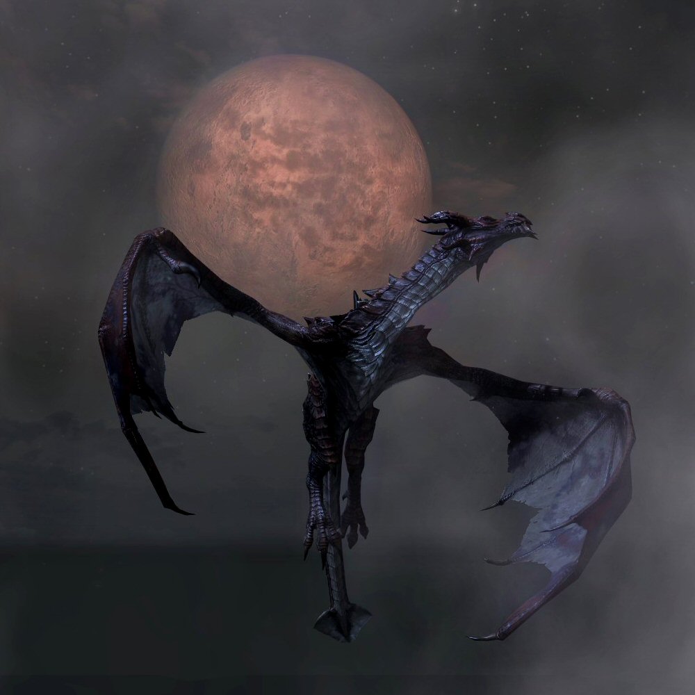
... Yeah.
- Owoooooooo!: As nominator. Minor EditsThreats•Evidence 05:12, 10 November 2012 (GMT)
- Support: Y. E. S. • JAT 05:54, 10 November 2012 (GMT)
- Oppose: I hate to be the first buzzkill, but here it is: I do like how the image looks. It's a very nice image, but it just doesn't give me that "Wow!" that other FIs have done. Yes the moons look cool, but the image is otherwise just a standard side shot of a howling wolf (a pink one at that o.O ). ES(talk•email) 06:06, 10 November 2012 (GMT)
- Support: That is just amazing. The position is very well captured. The background, with the stars and the two moons, it just looks amazing.--Skyrimplayer (talk) 14:04, 10 November 2012 (GMT)
- Support: Besides what's been said, this picture not only looks good as a thumbnail, but looks even better full-sized. --WoahBro (talk) 21:02, 10 November 2012 (GMT)
- Support: I love the detail on the fur, despite the fact that it is a ghost. The moons are a nice touch too. RIM (talk) 22:33, 10 November 2012 (GMT)
- Mild Opposition: It's a pretty good image, when it's full sized. In my personal opinion, it looks a bit busy and jarring as a thumbnail, which is what it will be on the front page if it becomes a featured image. I guess it's just the way the plants can be seen through the body. Other than that, it's a-okay with me. --SlyKhajiit (talk) 23:10, 10 November 2012 (GMT)
- Support, although the lighting on the ground looks odd. —Legoless (talk) 01:04, 11 November 2012 (GMT)
- Support: I actually think that being able to see through the wolf improves the image, though I'm not sure why. And the fur detail is great (I especially love the fang sticking out!). --Vulpa 02:34, 11 November 2012 (GMT)
- Support:Wow, simply amazing. Like others said, detail is great, and its captured at just the rite time with a fantastic backgrd. and its a wolf 'spirit', ofcourse u can see through it. I actually thought this was prereleased, but i was wrong :)--Honeystars (talk) 05:33, 15 November 2012 (GMT)
- Neutral: I am very conflicted on this one, because it is a great image, but part of it is not perfect. First of all, I would like to say that there is a great pose, great angle, etc. It also happens to be one of the best thumbs around. My issues, however, arise when the image is more closely inspected. When the image is put into full size, a few issues crop up. The first is that the hair on the wolf's back is a bit odd to me. Second is that the plants and ground mildly detract (but that is only a minor qualm) from the image. My third and largest issue is that of the legs and feet. I don't like how the legs aren't just transparent, they simply aren't there. I greatly dislike the fading of the feet and legs, and that is what mainly takes away my support vote. That being said, it is an awesome shot, which almost outweighs the blemishes, and a great thumb, as the problems are less noticeable in the smaller form. So what this really means is that I just wrote a paragraph without supporting either side just to waste everyone's time :) --HalfStache 22:07, 6 August 2012 (UTC) 06:03, 15 November 2012 (GMT)
- Oppose: I agree with Eric Snowmane; it's a cool picture, but not so special that I really think it should be featured. Weroj (talk) 15:14, 15 November 2012 (GMT)
- Support: I have a hard time figuring out how this image could be any better. Yes, the fur could probably be manipulated for a more 'natural look' (or blend a bit more into the landscape if you will), but that is a very minor gripe on an otherwise excellent image. The main page would shine with this as a FI. --Krusty (talk) 15:28, 15 November 2012 (GMT)
⇠eshetalk 15:36, 29 November 2012 (GMT)
| Prev: Archive 2 | Up: Featured Images/Past Nominations | Next: Archive 4 |