User talk:Daric Gaersmith/Sandbox/Veh
Contents
Some additional info[edit]
While I don't think the wall can be truly translated without more info from the devs, I have some additional images that might help you.
The text seems to be the same one as used on the Black Books, and as you mentioned, it looks like it marquees around repeatedly. The text on the books flows from horizontal to vertical, so there might be no way of knowing what is the "correct" orientation. In addition, the glyphs also appear on the Eye of Magnus, however I don't think that has anything to do with there being a connection within the lore (Unless you want to speculate the language is Ehlnofex or something.)
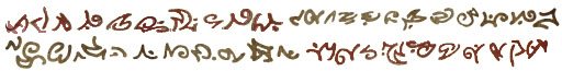
Either way here are the three images:
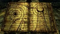
Close up text from a Black Book.
Black Book/Word Wall text
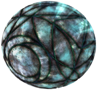
The glyphs also appear on the Eye of Magnus.


--Jimeee (talk) 14:38, 23 April 2013 (GMT)
- Agreed. I've Identified several languages being used already, with some unknown script in there as well. I can clearly see some elder in there, with what appears to be slightly modified falmer. Also, I think there is some japanese thrown in there as well... (If it is japanese, one small section of it reads "Riteruro"). We would need more info. Jeancey (talk) 14:56, 23 April 2013 (GMT)
- I'm pretty sure the correct orientation of that should be rotated 90° CW. You're probably out of luck with the Elder alphabet - as far as I know there is no known translation of any of the characters in that, and it's definitely not a straight Roman-alphabet cypher, as there are more than 26 characters. I do notice that the texture contains a lot of repeated passages. This to me says the artist made just a few lines of text and copy/pasted to fill the rest. Given the way that it's presented in-game, moving in many overlapping layers and such, I'd say that it is not intended to be read. Odds are that it is random and thus untranslatable. It's a cool texture effect, but I very much doubt there's any readable text in there. — TheRealLurlock (talk) 15:23, 23 April 2013 (GMT)
- Addendum - it actually looks like the same lines have been rotated 180 degrees, so it could be rotated either CW or CCW, but again, this makes it even more likely that it's just random unreadable text. (The same was true of the Elder alphabet, though I don't remember any repeated passages there, but it's likely there are, it's just kind of hard to tell as obscured as the text is on the scroll.) — TheRealLurlock (talk) 15:26, 23 April 2013 (GMT)
- Addendendum - The text on the Elder scroll definitely has whole lines that repeat, though not in the same order. Again, very much seems like an artist just copy/pasted stuff at random. — TheRealLurlock (talk) 15:31, 23 April 2013 (GMT)
- So, I rotated the texture image, and isolated it to just two lines. These are the only two lines which appear in this text. They may be flipped 180°, so there are 4 possibilities, but these are the only ones.
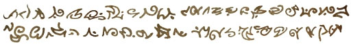
- This unfortunately means that cryptanalysis by letter frequency is going to be nearly impossible, since the sample size is too small, and almost no characters are repeated. (I can see some characters which appear in both lines, though flipped 180° between them - 3rd-10th from left on top line and 3rd-10th from right on bottom. Beyond that, I see no other common characters. — TheRealLurlock (talk) 21:22, 23 April 2013 (GMT)

- (edit conflict) Thanks Jimeee, Jeancey, and TRL, there's some great info here. I agree that Jimeee's image of the glyphs by themselves needs to be rotated 90° clockwise. Some of the lines of text appear to be mirror images, or are rotated 180°, as you say TRL, but I think that has just been done to confuse. I'm not confused by that, and I can see you weren't either, TRL. I think we have enough smarts between us all to work this thing out. The developers are not gods, they're humans just like us.
- I haven't started an in-depth examination of the glyphs themselves yet, so I'm hoping you're incorrect in your assertion that there are other languages, such as Japanese, mixed in amongst the text on the Word Wall, Jeancey. Cyphers of more than 26 glyphs are not impossible to decipher, but you're right TRL, they are more difficult than a straight transliteration of Roman-alphabet letters. I'll start by slicing and dicing that image of the glyphs from Jimee, and see if I can make some "sentences" that we can work from. (hmm, since the edit conflict, it looks like TRL had the same idea, nice work!)
- I'm not convinced yet that the glyphs on the Eye of Magnus are the exact same as those on the Black Books and the Word Wall. As I say, I haven't yet done an in-depth study of the glyphs themselves, but passing my eye over both, I don't readily recognize any glyphs that are identical between the two. I may be wrong on that though, as I've only taken a cursory look so far. — Daric✐ 21:54, 23 April 2013 (GMT)
- Oh, and you're saying 3-10 are flipped, TRL? I'd say it is more likely to be 1-10. I don't know the source of Jimeee's image, or how it was created, but it looks to me like that first glyph of your sliced sample TRL, is a misshapen form of glyph 1 from the right on the second sentence. Glyph 2 from the left on the top and glyph 2 from the right on the bottom are definitely the same, just mirrored. My mental 3D rotation ability was tested recently as part of my Aspergers diagnosis, and it came out to be very high. Hehe.
- Looking again at those first two glyphs from the top left, and the same two from the bottom right, it seems that they are decaying in the top sample. This could be caused by the curve of the Word Wall. If we break the second glyph into its components, (now that TRL has so nicely rotated them for us), we have a vertical and an angle. In the bottom example of glyph 2, the angle is comprised of three strokes, while in the top example only 2 stokes appear. The vertical part of the bottom sample is curved, but the vertical of the top sample is angular. I'm sure these are two examples of the same glyph, but the top sample is eroded. We need good, clean sources to work from. That's why I suggest we capture some video of the Word Wall, and chop it up from there. No disrespect to your image, Jimeee, its great, but I can see how hard it is to get clear, clean sources to begin with for this translation. — Daric✐ 22:02, 23 April 2013 (GMT)
- I believe Jimmee's picture is the actual texture file used in the game, which is by definition the cleanest image you're going to get. Its size is a good indication of that (512x512 - square images with a power of 2 dimension is required or at least recommended for most common 3D engines). I just rotated it 90° and cropped it to the bottom two lines. The first 2 chars on the upper line are similar to, but not identical to the last 2 chars on the lower line (after rotation). But anyhow, the rest of the image can be ignored, since it's just these same 2 lines repeated and possibly rotated. I do think you'll find that it's too small a sample to get any kind of results from letter frequency. I don't want to discourage you from trying, but I seriously doubt you're going to find anything here. It wouldn't be the first case of just random characters being used in the artwork. (See Divine Metaphysics/Egg of Time, Daedric text used on armor and weapons in Morrowind, and also the Elder alphabet for examples.) Those Dwemer texts we've even had confirmation from one of the devs that they're probably random. — TheRealLurlock (talk) 22:58, 23 April 2013 (GMT)
(←) If that is the texture file from the game, then it does answer another of those nagging thoughts I had about this. From what I can see in-game, there are about three or four layers of that unknown text on the Word Wall, underneath the layer that is written in Dragon Language. That is not counting the layers that are written vertically, only those that move horizontally across the Word Wall. If this is the only texture from from the game data, then I can assume that the text will be the same across all layers. They probably just have it starting at an offset, and the layers are moving at different speeds, and even then not at a constant speed across the width of the Word Wall, so that the lines of text on the Word Wall appear to be different. I appreciate the negative comments here as much as the positive, but I'm not yet ready to admit defeat. 😏 — Daric✐ 23:29, 23 April 2013 (GMT)
- I've had a bit of a play with the image you posted, TRL. I've taken the glyphs from the bottom line of your copy of Jimeee's image and rotated them, coloured them, and superimposed them back onto their corresponding places on the top line, with some transparency to make it more obvious. It really looks to me like glyph one and two (from the left) on the top row are the same as the the first two glyphs from the right on the bottom row, just degraded somewhat. I'm keen to hear back from Jimeee on the actual source of that image. I note that the licensing on Jimee's image doesn't give any hint that it was sourced directly from the game. — Daric✐ 00:55, 24 April 2013 (GMT)

Skyrim Oghma Infinium[edit]
Hey, if you're looking for another translation project (oddly enough also involving Hermaeus Mora), might I recommend the Oghma Infinium? It looks like it's just the Magic Script alphabet. That looks more likely to be translatable, especially since we know the letters for that alphabet, but it's kind of small and my eyes hurt looking at it. — TheRealLurlock (talk) 01:58, 24 April 2013 (GMT)
- Sure, I can transliterate that image (I thought that had already been done somewhere), but I can't translate it. As far as I know there is no language information for the Magic Script alphabet, only direct transliterations of the glyphs. Zooming in the browser (CTRL+"+") is a useful tool here. — Daric✐ 02:10, 24 April 2013 (GMT)
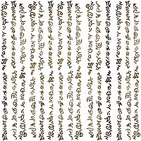
- I've had a go at this today. I haven't even completed the top left corner of Page 1 of the Ohgma Infinium from Skyrim. This is a sample showing it partially transliterated from the Magic Script Alphabet. Even magnified, with such low resolution it sure is hard to read those glyphs!

- I hope you don't mind, I separated this discussion out into its own thread, so we could keep the discussion about the Diiv Word Wall flowing. This has been a good little exercise for me though, as I can see how hard it is to identify those glyphs accurately at low resolutions. At one point today I had to go back and change all the glyphs I had previously identified as an "L" on the Oghma Infinium page, and mark them all instead as "D", because I came across a glyph that looked more like the Magic Script "L" than the one I had already been using for the "L".
- Also from this experience, I have found that it would be good to have either (a) have someone check my work, or (b) have someone else making the same translations as I am, independently of me, and compare notes afterwards, to see if our results agree. What methods were used for translating other in-game languages previously? — Daric✐ 08:59, 24 April 2013 (GMT)
- We do have translations for some Magic Script text. The text in Shalidor's Insights has been mostly translated - turns out it's in Portuguese for some reason. (This needs to be added to the page.) Not sure if that's the case here as well. The same alphabet can be used to represent text in multiple languages (e.g. Dwemer vs. Ayleid vs. Falmer), but usually it's just English. I think for the Oghma Infinium, the bottom section looks most promising. But yeah, it is hard to read, which is why I wasn't eager to do it myself. Also, given that you can't see it in the game for more than a few seconds, it's potentially not meant to be read, but then, they are probably aware that people can extract the texture files to peruse at their leisure, so there just might be something there. Most of the other translations I think have been done by the good people at The Imperial Library. You might want to check there to see if they have anything on either of these. — TheRealLurlock (talk) 11:09, 24 April 2013 (GMT)
- Heh. Just found something there: [1]. Yes, it's Portuguese again. — TheRealLurlock (talk) 11:31, 24 April 2013 (GMT)
- So, yeah, I'm glad I didn't go any further with translating from the source image we had. It was so difficult to identify the glyphs at such a low resolution. Here is my translation again, but this time with the corrections from the Imperial Library added in blue. I think I did reasonably well. Mistaking the C's for H's, and the N's for C's, I was pretty consistent in my mistakes. 😁 — Daric✐ 21:36, 24 April 2013 (GMT)

- I've already taken a crack at both pages - you can see the results here. The first image was building off of another image, so at some point I may replace it. I got through the vast majority of the glyphs on the first page, but only through some of them on the second page. • JAT 20:00, 25 April 2013 (GMT)
Diiv Word Wall Resolution[edit]
[The previous] little exercise really did show the importance of having a good source to work from. When it comes to working on the Diiv Word Wall, we will need a good, clear image of the text, and I'm not convinced that the image provided by Jimeee is clear enough, because of that discrepancy I identified with the first two glyphs looking degraded. Capturing the Diiv Word Wall text is going to be interesting, because, as the text flows across the face of the Word Wall, it appears to stretch in places as well, further distorting the shape of the glyphs. — Daric✐ 21:36, 24 April 2013 (GMT)
- As I said, I'm pretty sure that's the actual texture used by the game, discrepancy and all. It may appear larger sometimes on the actual wall, but that's only because it's blown up. It won't be any higher resolution, thus you won't get any more detail than you would if you just blow it up yourself in Photoshop. Plus the skewing, stretching, moving, and overlapping of the wall texture effect means it'll be basically impossible to find a cleaner image. I'd say just stick with the image we've got, regardless of the slight difference between those two characters. The only way you're likely to find a better one would be if you raided Bethesda's offices. (Maybe some day they might release a high-res texture pack for DB to go along with the one already released for vanilla SR, but until then, this is what we've got.) — TheRealLurlock (talk) 03:07, 25 April 2013 (GMT)
- I've already posted a screenshot that I have taken myself which contains some of the glyphs in better resolution than Jimeee's image, so I know it is possible. My screen shots are taken using a digital camera and my 32" LCD TV, because I play on the XBox. Someone with the PC version of Skyrim would be able to get much better screenshots than I can get. The problem is, it would need to be a video capture at first for this Word Wall, rather than just a still image, as the glyphs are moving. Then from the video we can get still images of each glyph, in order, in a higher resolution. I'm happy to generate the stills myself from the video, if someone could just capture the video in the first place.
- Also, I'm hesitant to use that image from Jimeee without a statement from him about the source of the image. I note from Jimeee's profile page that he plays on the XBox as well, so chances are, like me, he may not have access to the Creation Kit. I know, resource files can be extracted directly from the XBox and copied onto a USB thumb drive and transferred to a PC, but I don't want to go assuming that is what Jimeee did to obtain his image. The fact that there is no licensing information on that image also leaves me wondering. Like I mentioned on Jimeeee's talk page, I'm pretty sure I have seen that image somewhere before. A "visually similar" image search feature on the wiki would really help here, but even Google's visually similar search is still quite experimental. — Daric✐ 07:20, 25 April 2013 (GMT)
- Hi, sorry for not replying sooner. In regards to the image of the vertical text I posted - sorry I neglected to post the no licensing information. I claim no ownership of it as I downloaded the image from a lore forum topic I was reading through a while back about the subject - either on reddit or the official forums, I can't recall. Like Lurlock said, I think it's been pulled from the game files, but I have no other information. Sorry. --Jimeee (talk) 09:15, 25 April 2013 (GMT)
- Also, I'm hesitant to use that image from Jimeee without a statement from him about the source of the image. I note from Jimeee's profile page that he plays on the XBox as well, so chances are, like me, he may not have access to the Creation Kit. I know, resource files can be extracted directly from the XBox and copied onto a USB thumb drive and transferred to a PC, but I don't want to go assuming that is what Jimeee did to obtain his image. The fact that there is no licensing information on that image also leaves me wondering. Like I mentioned on Jimeeee's talk page, I'm pretty sure I have seen that image somewhere before. A "visually similar" image search feature on the wiki would really help here, but even Google's visually similar search is still quite experimental. — Daric✐ 07:20, 25 April 2013 (GMT)
- Yeah, that screenshot is not better resolution. It's just blown up larger. Trust me, this is what I do for a living (or would be doing if I weren't currently unemployed). Unless they used higher res textures for everything on the Xbox version, which I think is highly unlikely. (If anything, they'd maybe be smaller since consoles have stricter memory limitations than PCs. On a PC if you run out of memory, it just uses virtual memory and runs slower. On a console, if you run out of memory, it crashes. So they do everything in their power to prevent this from occurring.) — TheRealLurlock (talk) 10:58, 25 April 2013 (GMT)
- Thanks for the information Jimeee. So it seems we're still unsure of the origin of that image. Just because it is 512px by 512px in size does not automatically mean it is extracted directly from the game data. It isn't hard to make a 512-square image. Without knowing exactly where this image came from, it is hard to say. And I still insist that those two glyphs look decayed, so I doubt they would appear like that in the game data. I may be wrong though. Would someone with access to the Creation Kit be able to extract the texture file for us, to give a definitive answer?
- As to the question of resolution, surely the underlying sprite map in the game data, when rendered in-game, is dependent on various other factors for determining its visual resolution? For instance, on a PC, it would depend on the quality of the video card and the resolutions it enables, and the quality of the display monitor and the resolutions it enables? On the Xbox it is mostly about the connection you use (composite cable or HDMI), and the resolution of the television you connect it to. The way the sprite is displayed on the screen will determine its resolution, as in, the number of pixels that are used to display each pixel of the underlying sprite, am I right? This determines the resulting resolution, not the resolution of the sprite map in the game data. I may not do this for a living, but I like to think I understand a thing or two about games by now, having played a lot of them and pulled a lot of them apart with hex editors and such. Also, there can be smoothing subroutines used within the game mechanics, similar to the ClearType algorithm that improves the appearance of Truetype fonts. — Daric✐ 19:44, 25 April 2013 (GMT)
- I only have the Xbox files, which use a different image format (which there appears to be no converter for), but the texture appears to be
Dragonborn.bsa/textures/dlc02/dungeons/apocrypha/bookwall01.dds, although it may actually beDragonborn.bsa/textures/dlc02/effects/tentacletext01.dds. Someone else with the PC files will have to check this, though. • JAT 20:08, 25 April 2013 (GMT)
- I only have the Xbox files, which use a different image format (which there appears to be no converter for), but the texture appears to be
- ClearType would be irrelevant, since it's not a font. (At least not at the level where we see it, since it's already baked into an image.) And a texture by definition CANNOT be seen with higher resolution than its original texture source file. It can be larger, but when it is, the image must be blown up. It can't just create more detail out of nowhere. Depending on the algorithm the image will either appear pixellated or blurry if viewed at larger than its source data. There's no way that it can get more detailed. (Which is why I always laugh when the cops in those crime-drama shows take footage from a cheap security camera and zoom in and enhance until they can see the reflection of the criminal in the victim's eyeball or something. It's simply not possible to zoom past the native resolution of the source.) Now, .dds files have a feature which is that they usually contain the same texture at varying resolutions, but this is so that the engine can use a lower resolution version when the texture is far away, thus saving memory. Anyhow, since you asked, here's proof that those two characters are indeed degraded even in the original texture file. I just took your screenshot and circled all the instances I could find of those characters in their degraded form. It's repeated quite often, so you can't blame it on anything but the texture itself. — TheRealLurlock (talk) 12:13, 26 April 2013 (GMT)
(←) My comment: "Also, there can be smoothing subroutines used within the game mechanics, similar to the ClearType algorithm that improves the appearance of Truetype fonts." (emphasis added)
Your comment:"ClearType would be irrelevant, since it's not a font."
Do I need to say more?
Thanks for pointing out that there are instances of those degraded characters displayed on the Word Wall. Seems likely that the image Jimeee posted is, in fact, directly from the game data then. I acquiesce, in light of this evidence. I just didn't like the idea of jumping to conclusions in the absence of any other evidence. Jimeee had admitted he didn't know where the image came from. Now, with a little more examination, we have conclusive evidence that it is likely to be sourced from the game data. I have no further objections to this being accepted as fact.
To be honest, with all that has been going on today on the UESP wiki (such as this and this), I've kinda lost all enthusiasm for this and other editing around here. I think I need a wikibreak. — Daric✐ 05:54, 27 April 2013 (GMT)
- I know how that feels - I took a break that lasted for 3 years. Don't leave on my account though. I'm not trying to discourage you from working on this, just letting you know that in my "professional" opinion (both as a game developer and as someone who's spent a good deal of time trying decode fake ES languages), it's not likely to lead to anything. — TheRealLurlock (talk) 11:14, 27 April 2013 (GMT)
Diiv Word Wall and the Eye of Magnus scripts[edit]

Having taken a step away from this for a while, I found that the discussion on the UESP forums had continued in my absence. There was a very clear copy of the text from the Eye of Magnus in that thread, posted by Avron the S'wit, and I was able to discern from it that the writing on the Eye is the same as the writing on the Diiv Word Wall. Not just that the glyphs look the same, but that they are actually strung into the same phrases! I have made a colour-coded image to more clearly show this.
I still have no idea what it all means, if anything at all, but it is interesting to see that Bethesda used the same phrases on the Eye as they did on the Word Wall. Anyone care to do the same comparison for the Black Books? — Daric✐ 03:59, 20 May 2013 (GMT)
- User SmallFries on the UESP forums contributed a hi-res copy of the Black Book text, and I have painted a part of it in my colour-code. Once again, the three phrases identified from the Eye of Magnus appear on the Black Books, as well as on the Diiv Word Wall. In fact, if you look closely, the entire content of the Black Book appears to be made up consistently of only these three phrases. The Diiv Word Wall is likely to be the same. As TheRealLurlock pointed out earlier, this would be because of the texture image from the game data that Jimeee posted above. So both the Diiv Word Wall and the Black Books, which both came with the Dragonborn add-on, make use of the same phrases as seen on the Eye of Magnus, which came with the vanilla Skyrim game.

- I'd be interested to see the texture file from Skyrim for the Eye of Magnus. To me, it seems that the Eye holds the key to this language, as there seems to be a wider selection of glyphs on the Eye, including ones that aren't represented in the three common phrases. I think it would be interesting to see how many glyphs there are on the Eye that are common to the three phrases, but are seen in different arrangements. Also, of course, it would be interesting to see how many glyphs are unique, ones that don't appear in the three phrases at all. — Daric✐ 22:35, 27 May 2013 (GMT)