UESPWiki:Featured Images/Past Nominations/Archive 5
| This is an archive of past UESPWiki:Featured Images/Past Nominations discussions. Do not edit the contents of this page, except for maintenance such as updating links. |
This is an archive of past nominations for Feature Images from December 2013 to November 2014.
Contents
- 1 File:ON-place-Stonefalls.jpg
- 2 File:SI-place-Enjaen Sea.jpg
- 3 File:ON-place-Alessia Bridge.jpg
- 4 File:ON-interior-Daggerfall Cathedral.jpg
- 5 File:ON-quest-Sever All Ties.jpg
- 6 File:ON-quest-Carzog's Demise (quest) 02.jpg
- 7 File:ON-quest-Daughter of Seamount 02.jpg
- 8 File:OB-npc-Martin 05.jpg
- 9 File:OB-quest-Bear Season.jpg
- 10 File:ON-place-Phaer Wayshrine.jpg
- 11 File:SR-place-Blacksmith Quarters 02.jpg
- 12 File:ON-place-Alcaire Dolmen.jpg
- 13 File:ON-place-College of Aldmeri Propriety.jpg
- 14 File:ON-place-Mathiisen.jpg
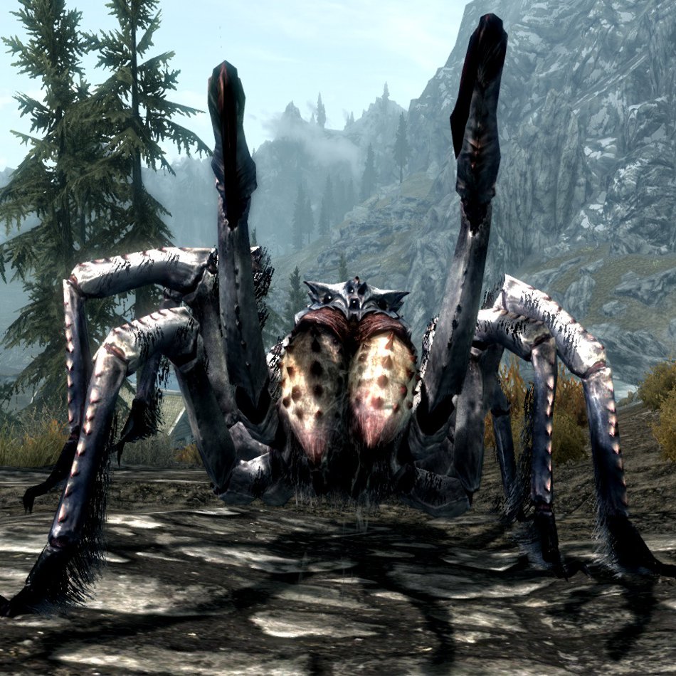
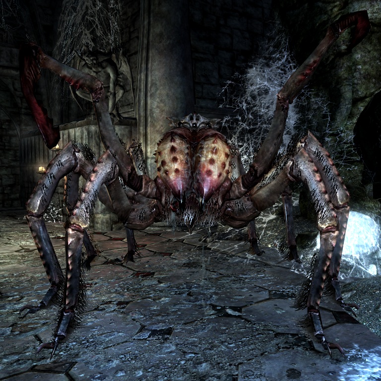
- 15 File:SR-creature-Wounded Frostbite Spider.jpg
- 16 File:ON-place-The_Wailing_Prison_02.jpg
- 17 File:SR-quest-Kill Anoriath.jpg
- 18 File:OB-npc-Martin 02.jpg
- 19 File:SR-place-Druadach Mountains.jpg
- 20 File:RG-quest-Investigate the Ruins 15.jpg
- 21 File:SR-place-Ivarstead.jpg
- 22 File:DB-quest-Experimental Subject.jpg
- 23 File:SR-quest-The Jagged Crown.jpg
File:ON-place-Stonefalls.jpg

This image looks like a painting to me. I think it captures the volcanic side of Morrowind pretty well, without making it look all ash and grey. The faded background is a nice touch too, bringing a lovely contrast to the lava and rocks.
- Support: As nominator. —<({QT>> 06:34, 6 November 2014 (GMT)
- Support: This is a nice scenery shot. I think it captures what this region looks like quite well, and the contrast present in the image is excellent. Forfeit (talk) 06:52, 6 November 2014 (GMT)
- Support: It's pretty hot. Weroj (talk) 07:06, 6 November 2014 (GMT)
- Support: A very well-composed shot of a naturally interesting environment. -- Hargrimm(T) 14:22, 6 November 2014 (GMT)
- Support: It sees a bit too focused on that tree in the middle that looks a bit too strange, but nevertheless a good image. -- SarthesArai Talk 19:42, 6 November 2014 (GMT)
- Oppose: It's pretty in 90% of the image, but I agree that the tree is rather strange, and the lighting on the piece of ground between the foreground elements and the tree just looks strange to me. -damon talk ♥ contribs 19:45, 6 November 2014 (GMT)
- Question: I suppose I can't vote if I'm the author, can I? -Vordur Steel-Hammer (TINV1K) 01:40, 7 November 2014 (GMT)
- Support: Well, I've also noticed that it reminds me of a painting. The colors are vivid and the contrast is good (which was not intended; it was a result of an unexpected change of weather). It may look very nice on the main page. --Vordur Steel-Hammer (TINV1K) 02:17, 7 November 2014 (GMT)
- Support: Only because I'm happy to see MW in decent quality.--Tiberseptim2 (talk) 07:30, 10 November 2014 (GMT)
- Support: Huh, could have sworn I voted for this already. Anyways, very pretty image that looks almost like it was taken by Zenimax to promote the game's graphics. Tiber: This is from ESO? Unless you mean the province Morrowind? ~ Ad intellige (talk) 23:36, 10 November 2014 (GMT)
- Support: While I do think that the tree looks a bit strange, overall I quite like this image. --Kalis AgeaYes? Contrib E-mail 23:47, 10 November 2014 (GMT)
- Support: Very nice. Biffa (talk) 19:17, 11 November 2014 (GMT)
File:SI-place-Enjaen Sea.jpg

Seems nice and cinematic,
- Support as nominator. --Tiberseptim2 (talk) 06:30, 2 November 2014 (GMT)
- Oppose: Looking at the thumb, I really like it. After looking at the full image, I notice a pretty big issue: the trees on the island to the right. They look almost as if the shot was taken at an awkward distance where they weren't fully loaded into view (I can't think of the technical game word). Anyways, that pretty much ruins this otherwise nice shot for me. •WoahBro►talk 06:41, 2 November 2014 (GMT)
- Oppose: Same. Trees aren't rendered. -damon talk ♥ contribs 06:47, 2 November 2014 (GMT)
- Oppose: Distant trees are drawn as sprites, whereas near trees are full-fledged 3D-models. If you decrease the distance to a far tree, first the 3D-model fades in, and then the sprite startes to "dissolve". This is what happened in this screenshot. Tis phenomen is especially notable at the asymetrical shivering isles trees, as the sprite may be a mirror-image of the 3D-model (as seen at the leftmost tree of the right island). -- SarthesArai Talk 10:17, 2 November 2014 (GMT)
- Oppose: In the thumbnail the islands seem to be floating to me, although that could very easily be my bad eyesight. Plus, the tree issue. ~ Ad intellige (talk) 22:06, 2 November 2014 (GMT)
- Oppose: Same issue with trees. Biffa (talk) 03:41, 3 November 2014 (GMT)
- Oppose: Great as a thumbnail, awful in full size. Weroj (talk) 07:06, 6 November 2014 (GMT)
File:ON-place-Alessia Bridge.jpg

Another nice picture, combining architecture, rocks, trees, a river, and a clear blue sky.
- Support: As nominator ~ Dwarfmp (talk) 22:12, 30 September 2014 (GMT)
- Support: This looks really good. It has a sort of symmetry to it that makes me like this image a lot. Forfeit (talk) 00:56, 1 October 2014 (GMT)
- Support: Excellent image. —<({QT>> 02:42, 1 October 2014 (GMT)
- Oppose: I haven't played ESO so correct me if I'm wrong, but I'd say since most of the action is happening on the bridge rather than below it, the primary shot of the bridge should also show the top of it. -- SarthesArai Talk 16:23, 1 October 2014 (GMT)
- Support: Can I support my own image? I think this was one of the best for architecture and surroundings. (If not, go ahead and discount this vote.) --Enodoc (talk) 08:41, 8 October 2014 (GMT)
File:ON-interior-Daggerfall Cathedral.jpg

This image caught my eye. Great textures on the wall and the windows or how do you call them. Very sharp-looking, good contrast, I think it nails the chapel atmosphere.
- Support: As nominator ~ Dwarfmp (talk) 22:12, 30 September 2014 (GMT)
- Support: The stained glass windows are beautiful and intricate, and the low angle feels very humbling to me, perfect for a place of religious worship. —<({QT>> 02:42, 1 October 2014 (GMT)
- Support: Wow. Great lighting, beautiful subject matter, and just perfect framing and timing. Very eye-catching, indeed. -- Hargrimm(T) 14:09, 1 October 2014 (GMT)
- Support: Great Image, perfectly resembling the feelings inside a cathedral. -- SarthesArai Talk 16:23, 1 October 2014 (GMT)
- Support: An absolutely beautiful image. Eldubya (talk) 17:46, 3 October 2014 (GMT)
- Support: Dramatic. Biffa (talk) 19:21, 6 October 2014 (GMT)
File:ON-quest-Sever All Ties.jpg

Maybe it's my passion for Oblivion speaking, but I think this gate looks great. A familiar sight in a different form.
- Support: As nominator ~ Dwarfmp (talk) 20:26, 20 September 2014 (GMT)
- Oppose: I like that it's an image of an Oblivion Gate, but the background of the image really doesn't add anything to it. If an image of an Oblivion Gate is going to be featured, I think that the scenery around it should look more like the Planes of Oblivion (or that the image could even be in Oblivion). Having not played ESO, I don't know if this is possible, but as it is I don't think this image is worth featuring since the only interesting feature is the Oblivion Gate with an otherwise unremarkable background. Forfeit (talk) 22:12, 20 September 2014 (GMT)
- Support:It's good to see an Oblivion gate again. The background is nothing special, but in my mind it doesn't need to be. --AN|L (talk) 00:32, 21 September 2014 (GMT)
- Oppose: To me, the only good thing here is the Oblivion gate. Everything else isn't particularly interesting, and the background's angle makes the front view shot look strange. —<({QT>> 04:14, 25 September 2014 (GMT)
- Oppose: Too grey in background, nice gate though. Biffa (talk) 20:29, 26 September 2014 (GMT)
- Oppose: I agree that the gate itself looks cool, but that's to the credit of the artist who created it, not the taker of this image. The bright daylight and clashingly ordinary backdrop really deprive this image of the menace and imposing mood that it should have. -- Hargrimm(T) 14:09, 1 October 2014 (GMT)
- Oppose: As stated above. -- SarthesArai Talk 16:23, 1 October 2014 (GMT)
- Support: The background is not dominant enough to be used against the Oblivion gate. I like it. —MortenOSlash (talk) 19:28, 1 October 2014 (GMT)
- Oppose: Although it is a nice image, I think the background is too boring for it to be a FI, and the size of the background in comparison to the gate makes it look... Puny. Eldubya (talk) 17:46, 3 October 2014 (GMT)
- Question: How many Oblivion gates appear in ESO? Is this a one-off occurrence, or are there a variety of other Gates which might have more suitable backgrounds? Insignificant RevisionsThreats•Evidence 23:17, 3 October 2014 (GMT)
- A good few. One in a burning Bosmer city and one in a High Rock basement spring to mind. —Legoless (talk) 23:33, 3 October 2014 (GMT)
- The best gate would probably be the one in the area of Deadlands where you get through the gate in High Rock. The landscape of the Deadlands looks just like in Oblivion and would probably look very good as a background. Unfortunately, you can't return there after completing the associated quest, so taking a picture of that gate would not be easy. -Vordur Steel-Hammer2 (talk) 03:45, 4 October 2014 (GMT)
File:ON-quest-Carzog's Demise (quest) 02.jpg
_02.jpg)
I think that we really need to get some online images (or articles for that matter) on the front page. So I'm nomating a few I think look good, even though I know nothing about the game itself. This one in particular has good contrast with all kind of sources of light over the whole image. It seems well centered on the objects of interest. Yes you can tell I don't know what is going on, nevertheless, I like it.
- Support: As nominator ~ Dwarfmp (talk) 20:26, 20 September 2014 (GMT)
- Neutral: Meh. The background is beautiful, but the people in the foreground clutter it up. I'm not going to downvote it because the rest of it does look good and I would assume there's no way to take it without the people, but it isn't good enough for an FI. --AN|L (talk) 00:32, 21 September 2014 (GMT)
- Support: This is a great picture from the quest in terms of colour and contrast, and brings together the essence of the plot. For context, the people on the left are arguing with the people on the right over what to do with the glowing whatsit in the middle. --Enodoc (talk) 11:35, 21 September 2014 (GMT)
- Support: Gorgeous colours. I love the sense of foreboding in this picture. —<({QT>> 04:14, 25 September 2014 (GMT)
- Support: Gorgeous colours. Biffa (talk) 20:25, 26 September 2014 (GMT)
File:ON-quest-Daughter of Seamount 02.jpg

This one has a great view of the city in the distance. I don't think I need to say more than that.
- Support: As nominator ~ Dwarfmp (talk) 20:26, 20 September 2014 (GMT)
- Support: Beautiful. Like Dwarfmp, I know practically nothing of ESO, but this shot is stunning. I'd love to see it on the front page. — ABCface◥ 20:34, 20 September 2014 (GMT)
- Support: An excellent view of the city. Having the character in the corner is another really nice touch. This'll look great on the front page for sure. Forfeit (talk) 22:12, 20 September 2014 (GMT)
- Support:Excellent, cinematic, shot. It tells a story. --AN|L (talk) 00:32, 21 September 2014 (GMT)
- Support: This is indeed a very beautiful view of Daggerfall. The colors and contrast are very nice and I also like having Lokra looking on. -Vordur Steel-Hammer2 (talk) 00:41, 21 September 2014 (GMT)
- Support: Brilliant picture which brings together the essence of the quest's story with a vibrant picture of the destination. --Enodoc (talk) 11:35, 21 September 2014 (GMT)
- Support: It's a lovely shot, and the character looking on makes it even better. —<({QT>> 04:14, 25 September 2014 (GMT)
- Support: Lovely image. Biffa (talk) 20:28, 26 September 2014 (GMT)
File:OB-npc-Martin 05.jpg

Looked like we could add another FI to the line. I believe to his one is interesting seeing brother Martin kick some booty!
- Support as nominator. --Tiberseptim2 (talk) 05:29, 5 September 2014 (GMT)
- Support: Very interesting, eye-catching image. I especially like the blood spatter off the Agent's left shoulder. --Xyzzy Talk 06:49, 5 September 2014 (GMT)
- Oppose: This image is vastly superior. Insignificant RevisionsThreats•Evidence 13:53, 5 September 2014 (GMT)
- Comment: This was already put up for nomination and no consensus was reached. I was strongly opposed to it then and I still am now. •WoahBro►talk 14:01, 5 September 2014 (GMT)
- Comment: I'm aware. I nominated it, and I consciously chose it over this one along with all other Martin images on the UESP. I'm not trying to be obstinate or petty about that image getting shot down; what's done is done. But it was and is the best Martin image we have; this one can't compare. Every FI should be the best possible representation of its subject, and this image definitely fails to meet that standard. Insignificant RevisionsThreats•Evidence 15:36, 5 September 2014 (GMT)
- Comment: I find the nominated image much more interesting than the one you linked ME, even though I ended up supporting it (I had to go back and reread its nomination to remember why I did). The image quality may be a bit better, but it's basically a straight-on picture of an NPC just standing there, while the nominated image is an action shot from an unusual perspective. IMO, we should be judging an image based on its merits, not how it compares to another image with a similar subject matter, and I think this image is FI-worthy on its own. --Xyzzy Talk 20:57, 5 September 2014 (GMT)
- Oppose: I do really appreciate capturing the expression on Martin's face, but the agent's texturing at the shoulder is just ugly. Blurry with that weird seam down the middle, and the whole shoulder/pauldron is weirdly deformed. Since that's what is front-and-center of the shot, it really damages it for me overall. -- Hargrimm(T) 14:47, 5 September 2014 (GMT)
- Support: The expression on Martin's face is perfect, given the situation. The angle directs much of the focus onto Martin, which helps to make the image even better. Forfeit (talk) 01:30, 6 September 2014 (GMT)
- Support: I really like the expression on his face. --AKB Talk Cont Mail 01:33, 6 September 2014 (GMT)
- Oppose: I Agree quite blurry texture in foreground detracts from image. Biffa (talk) 12:02, 6 September 2014 (GMT)
- Support: Seeing people appreciating my work makes me happy. I can tell you that I've spent a while to get this shot. I needed to focus on Martin while he was fighting an agent, and making swinging an iron dagger look impressive was not so easy. Take into account that he needs to stand in the light, and you know those fights go all over the place... I went with this shot because I liked the expression of Martin's face, the sparks in his eyes, and his stance. I wanted to make him look fierce, and I think I succeeded here ~ Dwarfmp (talk) 01:33, 10 September 2014 (GMT)
- Comment: I saw that. Safely standing behind a Mythic Dawn agent and having only them 2 fighting. Seeing a slash with painful aggression. Did you use the console? Big fan!--Tiberseptim2 (talk) 03:41, 14 September 2014 (GMT)
- Support: I like the action captured. —MortenOSlash (talk) 17:16, 10 September 2014 (GMT)
- Support: I've been thinking about this one for awhile and I wasn't sure about it for the longest time. Now that I look at it, I don't see any reason why I wouldn't support it. That blood splatter really seals the deal, wow. •WoahBro►talk 03:43, 14 September 2014 (GMT)
File:OB-quest-Bear Season.jpg

I really can't think of a better image for this quest. The image sums up the entire quest's story quite nicely. The expressions on the animals are all very good, particularly the bear attacking the one sheep. It's somewhat different when compared to other action shots on the wiki, but I think this is a brilliant image and would be a good choice to put on the front page.
- Support: As nominator. Forfeit (talk) 22:13, 5 August 2014 (GMT)
- Support: I don't usually take part in these but this is an excellent Oblivion image. —Legoless (talk) 22:16, 5 August 2014 (GMT)
- Support: Because the sheep in the middle looks like it's flying. Insignificant RevisionsThreats•Evidence 22:19, 5 August 2014 (GMT)
- Support: It can be tough to get good action shots in Oblivion, and this is a pretty cool one. I like it! ⇠eshetalk 17:04, 6 August 2014 (GMT)
- Support: I usually don't support images mainly because of the story behind it, but this really does capture the entire quest. I don't know, it gives me good vibes or something. Plus it's an Oblivion shot. I'm a sucker for a good shot from the older games. •WoahBro►talk 17:35, 6 August 2014 (GMT)
- Support: Made me laugh! --Beezer1029 (talk) 18:09, 6 August 2014 (GMT)
- Support: Sure, I'll support this image...when sheep fly! Erm... --Xyzzy Talk 21:26, 6 August 2014 (GMT)
- Support: It's pretty neat. --AKB Talk Cont Mail 00:23, 10 August 2014 (GMT)
- Support: I like flying sheep. ~ Ad intellige (talk) 03:31, 10 August 2014 (GMT)
- Support: A good demo of the AI. The animals are showing emotion. Screenshot could've been taken better but a good image for FI!--Tiberseptim2 (talk) 07:07, 10 August 2014 (GMT)
- Comment: Since it's been over 2 weeks since this was nominated, can we get an administrator to close this? •WoahBro►talk 03:16, 23 August 2014 (GMT)
File:ON-place-Phaer Wayshrine.jpg

Ah, Auridon. The loveliest of places to land after Coldharbour, IMO, and though this image is "just" of a wayshrine, it is nonetheless a stunning shot. I especially like how the archway's curve is repeated in the dome behind it.
- Support: As nominator. likelolwhat talk lulzy to me 05:24, 27 July 2014 (GMT)
- Oppose:Not a bad-looking image, but the problem I have with it is that it could be better. I think it would look better if it was taken from directly in front of the arch that's closest to the photographer, allowing you to see all the way into and through the wayshrine and to see the second arch, which is partially obscured by the first. --AN|L (talk) 15:07, 27 July 2014 (GMT)
- Oppose: Speaking as an experienced photographer and image editor, in terms of image quality, it is good, and although it is colourful, the contrast is a little off. Also, the lighting is bad; you can see the shadows of some off-screen trees on the arch, the shrine, and grass. The shrine is also off-centre, although that isn't the main issue. If the shot was taken from a different angle and/or taken at a different time of day for better lighting and to ensure that there are no shadows, this image will be a lot better. ~ Psylocke 01:59, 28 July 2014 (GMT)
- Oppose: Per Anil and Psylocke. I think it is a very pretty and high quality picture, but not good enough for FI. ~ Ad intellige (talk) 03:36, 28 July 2014 (GMT)
- Oppose: It's a nice, good-quality image, but just not quite FI-worthy IMO. --Xyzzy Talk 21:26, 6 August 2014 (GMT)
File:SR-place-Blacksmith Quarters 02.jpg

I think this is a superb image showing the intended area with beautiful clarity.
- Support: As nominator. Biffa (talk) 12:53, 19 July 2014 (GMT)
- Oppose: Eh... As the person who took this image, I don't see anything special about it. It may have "beautiful clarity", but I don't think it is FI worthy. ~ Psylocke 16:12, 19 July 2014 (GMT)
- Oppose: I'm sorry, I don't find it to be eye-catching. It's all too grey to me. —<({QT>> 06:17, 20 July 2014 (GMT)
- Oppose: While I feel the image captures the atmosphere of Windhelm quite well, it's still just an image of a forge that lacks anything that helps it to otherwise stand out. Forfeit (talk) 03:46, 26 July 2014 (GMT)
- Oppose: Per Forfeit, with the explanation that I hate Windhelm and thus capturing its atmosphere is not a plus. Also, though I don't think the thumbnail is all a FI can be judged on, this one is extremely bland to me and I, were I coming to UESP as a visitor/non-editor, would be almost... is repulsed too strong a word? It's hardly worthy of having 'Current Featured Image' slapped on top of it. likelolwhat talk lulzy to me 05:24, 27 July 2014 (GMT)
- Oppose: The image captures Windhelm's atmosphere, but is way too gray for my tastes. ~ Ad intellige (talk) 03:36, 28 July 2014 (GMT)
File:ON-place-Alcaire Dolmen.jpg

I think this image is of high quality and shows the Dark Anchor in a perfect environment.
- Support: As nominator ~ Ad intellige (talk) 12:48, 2 July 2014 (GMT)
- Oppose: Have been fairly undecided on this one, but I've decided to oppose this. The image is nice and of good quality, but none of the aspects of it really stand out to me. You have some ruins on the bottom and the Anchor on the top, but neither really work together to make the shot look more impressive. Instead, they made me look at the image in two separate parts that in themselves are good, but not fantastic. It's a small complaint, but I think that there are and will be better ESO images to feature than this. Forfeit (talk) 18:24, 18 July 2014 (GMT)
- Support: Think the different textures as well as the clarity give enough of a reason to support it being featured, although I haven't played ESO yet. Biffa (talk) 12:44, 19 July 2014 (GMT)
- Oppose: I don't play ESO, but to me, it seems like the anchor is the only thing that is eye-catching, with the blue lightning-ey stuff. The sky is very boring. The ruins are boring. Not a striking image to be featured. ~ Psylocke 16:12, 19 July 2014 (GMT)
- Oppose: While it is nice and clear, it just doesn't... come together and make an impressive image. —<({QT>> 06:17, 20 July 2014 (GMT)
File:ON-place-College of Aldmeri Propriety.jpg

A simple but pretty mix of Auridon's natural beauty along with the unique Altmeri architecture. It's cool how the bridge draws the eye to the College, and the sky is just bright enough to suggest a serene atmosphere. It's overall a great picture from ESO despite limitations of camera control.
- Support: As nominator. —<({QT>> 19:51, 28 June 2014 (GMT)
- Oppose: While it is pretty, and I would dearly love an ESO shot as a featured image, I'm going to have to oppose for now. It's the giant rock right in front of the College that is throwing it off for me. I feel like if the shot were taken from just slightly to the left, the rock would be an asset and not an eyesore. And the bridge would add depth of field instead of looking like a simple wall. Unfortunately, ESO's limitations are front and center in this image, and they don't have to be. likelolwhat talk lulzy to me 05:48, 29 June 2014 (GMT)
- Oppose: Per Likelolwhat's points. ~ Ad intellige (talk) 18:08, 29 June 2014 (GMT)
- Oppose: Yup, if this had a better angle or view, I wouldn't have a problem with supporting this image. •WoahBro►talk 19:00, 29 June 2014 (GMT)
- Comment: lol yeah I agree on the angle problem, but darn this pic has too much potential to be wasted. I'll ask Moinante if a better shot can be taken. —<({QT>> 19:06, 29 June 2014 (GMT)
- Oppose:Per the others. Too cluttered. --AN|L (talk) 21:14, 29 June 2014 (GMT)
File:ON-place-Mathiisen.jpg

Just saw this uploaded in the Recent Changes (as in the last few minutes), and just wow. I've always been a sucker for a good shot of a location, and this takes my breath away. I really love the shot from above the town and just all of the color and details (just looks at the ripples in the water!). I think this image really shows the beauty that ESO has to offer and would be great for the Main Page.
- Support: As nominator. •WoahBro►talk 23:54, 28 May 2014 (GMT)
- Support: nice to see something outside of skyrim and cyrodiil.--Tiberseptim2 (talk) 06:28, 2 June 2014 (GMT)
- Support: *needs money to play TESO* Schiffy (Speak to me|What I've done) 14:34, 2 June 2014 (GMT)
- Oppose: As much as I hate to be the one person who will oppose this image, I have to do so. It's a pretty image, but if this was any other game, it would be looked at as mundane. I don't want to feature a mundane image just because it's from ESO. Featured Images stand out and are remarkable, something a settlement shot isn't. I know we can do better than this on possible featured images, so I can't support this. -damon talk ♥ contribs 20:54, 2 June 2014 (GMT)
- Oppose: I'm sorry, it's a nice shot, but it doesn't strike me as memorable or FI-worthy, to be honest. I believe we can capture the subject in a more interesting light. (Unless that's impossible, in which case I'll support this.) —<({Quill-Tail>> 21:04, 2 June 2014 (GMT)
- Oppose: For the same reasons as above. Also, the earlier ESO images we feature should showcase distinctive looking areas of Tamriel that haven't appeared in games before, in my opinion. Sure this is Auridon, but it just looks like a village. --AN|L (talk) 22:36, 2 June 2014 (GMT)
- Comment: This is being ripped apart for being a shot of a village even though a shot of a single house was an FI...? •WoahBro►talk 00:22, 3 June 2014 (GMT)
- Comment: I opposed that one as well. But, the difference is this settlement shot looks like all the others for all the other games, and while still unremarkable to me, that house had lighting and other nice touches to it going for it. It felt different to the supporting voters than any other house would, because it stood out from them.. -damon talk ♥ contribs 01:13, 3 June 2014 (GMT)
- Oppose: To me, this image just doesn't have anything special. It is just a regular shot of a village. The only thing it has going for it is that it is from ESO. ~ Ad intellige (talk) 05:51, 13 June 2014 (GMT)
- Oppose: I'm going to break my normal habit of not voting for this one, and my reasoning runs along the lines of the opposers above me. An image really has to impress me to make me vote, and this image does the exact opposite. It's a shot of a village. Where's the interest factor? What makes this village, or this shot of it, special? There's nothing eye-catching here, it's just a village. (And if it makes you feel any better, I wouldn't have voted for the house, either, but apparently I missed that one.) – Robin Hood (talk) 12:21, 13 June 2014 (GMT)
File:SR-creature-Wounded Frostbite Spider.jpg

- Support as nominator. Eldubya (talk) 21:40, 18 April 2014 (GMT)
- Oppose: Eldubya, you're supposed to give a reason why you think this is a good image when you nominate one. Just posting an image alone doesn't suffice. And, I oppose this image, because I don't like the lighting. It's so bright on the front of the spider, yet as you look up, the spider's detail blends into the equally dark webs overhead. That aside, there isn't much of a wow factor to this image for me. When I look at it, I just see a spider. Nothing remarkable about that. -damon talk ♥ contribs 22:12, 18 April 2014 (GMT)
- Oppose:Image is fuzzy and not sharp. Both this and this are substantially better pictures of the same creature, so it's not even the best image we have of a spider. Plus, the subject is generic (it just has a different name), frostbite spiders are annoyingly common in the game, and it isn't doing anything interesting. --AN|L (talk) 22:25, 18 April 2014 (GMT)
- Oppose: For Skyrim it's nothing special. --Tiberseptim2 (talk) 01:24, 24 April 2014 (GMT)
- Oppose: Per the reasons listed above. •WoahBro►talk 07:12, 9 May 2014 (GMT)
File:ON-place-The_Wailing_Prison_02.jpg

I figure that a day one ESO image that's "Wow!" invoking is a little surprising, but this image has quickly grown on me. The mage/cleric/whatever underneath this beam of light shining down from this structure sells me. However, It's not yet in-use, I'll admit, so if passed, the nomination has to be held while it's given a use, which would presumably be relatively fast, as it is a recent upload. But, in a week when it clears, this will make a nice first ESO FI. Also, like was done with Skyrim, I like the idea of bumping this image ahead of the queue to show off something ESO related on the Main Page after the game comes out. Let's vote!
- Support: nominator -damon talk ♥ contribs 23:36, 30 March 2014 (GMT)
- Support: I fully support this image as FI, and I fully support bumping it ahead of Skyrim images. I also think that if it passes before it gets used we should feature it anyway, since I have no doubt it will end up on our Coldharbour page before long. --Nocte|Chat|Look 00:20, 31 March 2014 (GMT)
- Support: Looks fantastic. I can't think of a reason not to support this. Also, I'm okay with bumping it up in the queue, but I don't want a whole bunch of ESO images jumping over all of the current images in the queue. •WoahBro►talk 15:40, 3 April 2014 (GMT)
- Support: I love the sense of scale and foreboding here. Also in favor of bumping it up the queue. -- Hargrimm(T) 16:54, 3 April 2014 (GMT)
- Support: Cool shot. Feels really eerie and mysterious. I'd also support bumping this up, as long as it is used on a page by then. Forfeit (talk) 23:43, 4 April 2014 (GMT)
- Comment: It can always be moved in the future when someone works on the article at last, obviously, but for now I've replaced the pre-release concept art that opened on the article with this image, and that now satisfies the criteria that the image be in use on the wiki. It's good to go in that aspect now. -damon talk ♥ contribs 00:08, 5 April 2014 (GMT)
- Suggestion: Speedily end nomination successfully due to it being an ESO image, so it can be featured? --AKB Talk Cont Mail 00:15, 5 April 2014 (GMT)
- Comment: Sure, I'll agree with snowballing it. -damon talk ♥ contribs 00:24, 5 April 2014 (GMT)
- Comment: That's what she said. Anyways, how can we be sure that this is really the best possible image of this... Thing? I'm just concerned that we'll vote this in and soon find another pic with a better angle, or taken by someone with a ridiculously good graphics card, etc., and we'll end up regretting this. Minor EditsThreats•Evidence 00:59, 5 April 2014 (GMT)
- I honestly think it's fine. I wasn't expecting a first ESO image (or maybe even ESO images in general) to be this good. If it turns out there are better pictures, I don't think it really matters at all that we had a not-as-good image as the first ESO FI. Wow that was a lot of acronyms. •WoahBro►talk 01:15, 5 April 2014 (GMT)
- Support: M'kay. Minor EditsThreats•Evidence 15:40, 5 April 2014 (GMT)
File:SR-quest-Kill Anoriath.jpg

I saw this on the site awhile back and was saving it for a later FI nomination. Now that there are no current nominations and the queue is getting smaller, I think it's time pull this image out. What can I say? It's just sick.
- Support: As nominator. •WoahBro►talk 22:56, 23 March 2014 (GMT)
- Support:Great image. I love the divots you can see on the arrow. --AN|L (talk) 23:26, 23 March 2014 (GMT)
- Support: Sure, why not. It's a good image. -damon talk ♥ contribs 23:28, 23 March 2014 (GMT)
- Support: I'm impressed! That must've been very difficult to capture, and it's a great action shot. – Robin Hood (talk) 01:23, 24 March 2014 (GMT)
- Support: I'm a sucker for an image with an unusual perspective. It's not particularly eye-catching as a thumb, due to Anoriath being rather small in the image, but it really looks great full size. --Xyzzy Talk 04:30, 24 March 2014 (GMT)
- Support: Action shot in a guards perspective, arrow to the knee.--Tiberseptim2 (talk) 07:13, 26 March 2014 (GMT)
- Support: Oh, that's a good one! Great detail. --likelolwhat talk lulzy to me 18:19, 26 March 2014 (GMT)
- Support: An otherwise solid image with a unique angle. I'm sold. • JAT 01:28, 27 March 2014 (GMT)
- Support: While it doesn't play very well as a thumbnail, it is certainly a well-executed shot technically and I admire the effort that went into capturing such a unique image. -- Hargrimm(T) 16:54, 3 April 2014 (GMT)
File:OB-npc-Martin 02.jpg

I was bemused when I saw at full screen that the dagger pommel is sticking out through his robe, but that's just one of those things you have to live with in a game. Whatever, it's still an A+ image in my book. And perhaps it's intentional, like a biting commentary from Dwarfmp on Oblivion's combat system. Anyways, Talos and Akatosh, coming together with Martin Septim. It should send any lore fanatic thought-tripping for a while. Well-lit, centered, just all-around as perfect as the game would allow.
- Support: As nominator. Minor EditsThreats•Evidence 07:20, 28 January 2014 (GMT)
- Oppose: An image of Martin Septim would make for a glorious Featured Image, though with all the possible scenarios he could potentially be captured in, this straight-on image just falls below the bar. -damon xoxo 08:18, 28 January 2014 (GMT)
- Oppose: It's a nice symbolic image, but it's dull, so much gray that even the windows don't lessen the dullness. Silence is GoldenBreak the Silence 19:33, 28 January 2014 (GMT)
- Oppose: Honestly, a good Oblivion FI wouldn't have a glitch like this present.
Also, the image is, like Silencer said, gray(Eh, it's not terribly gray). Plus, a lot of the image (Martin's robe in particular) doesn't look very clear. •WoahBro►talk 20:03, 28 January 2014 (GMT)- Addendum: I think I'm going to ramble on more about why I don't support this image. First of all, I'm sorry, but that clipping just should not be in a Featured Image, plain and simple. Also, compared to other Oblivion images I've seen, Martin almost looks fuzzy, kind of like velvet or something. It may work for his robes, but his face looks weird. Or maybe I'm just crazy and he isn't fuzzy at all. Lastly, anyone can interpret anything in any way they want. Some may see Martin's troubled past with the gods here, I see a stone-face expression in a temple. Everyone probably loves scenery shots because they are beautiful and, well, serene. To me in particular, nothing is more calming and beautiful than a well-taken scenery shot. So again, everyone can interpret anything however they want to, and I just don't see what the supporters see in this image. •WoahBro►talk 15:05, 30 January 2014 (GMT)
- Support: I like this image. While it isn't flashy or over-the-top, it captures the very essence of Martin Septim in the best way possible. --Nocte|Chat|Look 20:18, 28 January 2014 (GMT)
- Oppose: I agree with Damon and Silencer that the image is rather dull compared to what else Martin Septim has done. It's a good image, but I wouldn't consider it FI-worthy. For me, what makes an image FI-worthy is if it stands on its own well - it tells a story by itself (a picture is worth a thousand words). The problem with this image is that its significance is only truly realized in context, and lacking that context, this image is rather dull in comparison. It's a well-taken image, but I don't believe it's the best image the site can offer. • JAT 22:50, 28 January 2014 (GMT)
- Oppose: Meh is what comes to mind here. No can do. likelolwhat talk lulzy to me 01:37, 30 January 2014 (GMT)
- Support: This image is monotously gray? I'm sorry but, the above nomination gets almost fully supported while that one is FAR more monotonous in color (while I don't think this one is monotonous at all, but hey, I'm dealing with a bunch of hard ballers and nitpickers while I'm a softie right?). I don't know how this image can get any better. I needed a shot of him in the church, I suppose I could have him dancing to get rid of the clipping, but that would harldy do justice would it? What would be dull is me not having gone through the effort to get him to stand exactly there and put lighting on him, and just taken a shot of him standing in a dark corner. You think it was as easy to take as using tfc to take a static shot of a location? If this doesn't capture the essence of what Martin is and goes through during the game, then I don't know what does. I could have had him more lit, I could have done all that, but it wouldn't do justice to the moment and what this image stands for, and it wouldn't do justice to the game. He's lost faith in the gods, but they are watching, he doesn't know yet he's a descendant from talos with the blood of akatosh. This picture says a lot of things while just standing still, that's exactly what makes it so great. And then people say it's not good enough, it's meh, it's bland, but you love an easy shot of a mountain, which says nothing but "it's a mountain", while inferior in contrast alone. I will never understand that, and I glad I won't. I don't mean to insult the above image, it takes some skill to take location shots, but I find it insulting that such comparably easy shots are praised while this one is shot down ~ Dwarfmp (talk) 09:23, 30 January 2014 (GMT)
- Support: I've been thinking about this one for a while (purely because of the clipping of the weapon) but the more I think about it, it's an issue I can live with. As a thumb, it's not too noticeable and, if I'm interpreting Dwarfmp's vote the right way, it's hard to avoid the clipping for a shot with the given pose. Aside from this, I basically support this image for much of the same reasons already given; it captures the essence of Martin perfectly. I also like the contrast between the grayer color of Martin and the much brighter stained glass in the background. The image being somewhat duller makes sense since a brighter, more colorful image would not make as much sense given the scene in the game that's being captured in it. Overall, the image captures this moment in Oblivion perfectly, so I can live with a common graphical glitch being present in the image. Forfeit (talk) 18:36, 30 January 2014 (GMT)
- Oppose: I'm ambivalent about this, but here goes: I do love how Martin is positioned between Akatosh's and Talos' stained glass windows, and how it symbolises him being the heir of the Empire. It's a nice shout-out to players of Oblivion who know the significance of this. But as Jak Attacka said, without context this image as a whole doesn't really stand out on its own; people should not have to explain why an image is so good—it should do it by itself. A Featured Image in my opinion should do that and capture the viewer's attention straight away, yet the contrast here is not enough to do so; the brightness of the stained glass is drowned in the grayness. It shouldn't be too flashy, as it would betray the context of the image, but just enough to catch the eye. The altar not being centred behind him also kind of ruins the balance. It's a good image and I appreciate the hard work that went into capturing it, but I think we could have done even better. —<({Quill-Tail>> 16:50, 2 February 2014 (GMT)
- Support: I debated this one internally for quite awhile, but decided I had to support it. I understand all of the opposers' reservations about, but in my mind, they are all limitations imposed by the game code. You can't pick Martin up and center him perfectly in front of the altar and between the windows, you can't recolor the scene to make it more eye-catching, you can't increase the graphics quality to Skyrim level (I think we've all been spoiled by this), and you can't reposition the hilt of his dagger. This is the best that can be accomplished within these strictures. What finally did it for me, however, was the symbolism of the windows behind him, and the opposing fates that they imply: does Martin take up his place as rightful heir to the throne, or does he allow himself to be sacrificed to end Mehrunes Dagon's assault on Nirn (assuming he ever had a choice). Like someone else said above, it gives a Lorefan like me goosebumps. --Xyzzy Talk 17:42, 2 February 2014 (GMT)
- Comment: I got goosebumps, too! When I had to get an image for the Martin lore page, I had about a dozen images of him to choose from. Martin with a book, Martin in armor, Martin on a horse, Martin casting a spell, Martin fighting, etc. I was browsing through them, thinking "Which one best captures Martin as a person?" Then I saw this one, and I knew I had my answer. Goosebumps then, and goosebumps looking at it again just now.
- Several people have mentioned that an image of Martin can be better. I dissent. The blood-red of the altar and the veritable symphony of colors in the stained glass more than off-set any dullness in the rest of the color scheme, and I don't notice any substantial fuzziness. This is not only the best image of Martin currently on the wiki, but I firmly believe it is the best spot in the whole game to capture the essence of Martin, and that we're not going to do any better than this. This is an FI-worthy triumph.
- That being said, to each his own. I feel these debates can get too heated at times, and while the opposition here is puzzling to me, it's good to keep in mind that reasonable people can differ on matters of taste. Minor EditsThreats•Evidence 20:23, 2 February 2014 (GMT)
- Support: The stained glass really pull this together for me. --AKB Talk Cont Mail 05:36, 16 February 2014 (GMT)
File:SR-place-Druadach Mountains.jpg

Great image, angle and fog add a sense of large scale. Looks great in a thumb and even close up it's awesome you start to see those small details like the Nordic arches and town. As someone who lives by 5 different mountain ranges, I believe this absolutely captures the monumental scope of those type of images. I may be wrong but this definitely caught my eye as I went through random Lore pages.
- Support as nominator. --Lore Master (talk) 12:33, 4 January 2014 (GMT)
- Support: Beautiful. The fog present in the image works perfectly and captures the image of this mountain range perfectly. The sky also looks very nice and further adds to the image. Forfeit (talk) 23:04, 5 January 2014 (GMT)
- Oppose: It just isn't very clear, in my opinion. The thumb appears hazy and blurry near the bottom and the land, and the image could all around stand to be a little sharper and clearer. The shot itself is pretty, but I don't like it as a feature image. -damon xoxo 00:27, 6 January 2014 (GMT)
- Support: Gorgeous image. I think it'll do very well as a FI. --likelolwhat talk lulzy to me 10:31, 24 January 2014 (GMT)
- Support: Amazing shot! I love the contrast between the sky and the mountains, and how the lighting is just at the right intensity to capture the viewer's attention. The fog and the houses are nice little additions too. —<({Quill-Tail>> 13:42, 24 January 2014 (GMT)
- Support: Naturally. Minor EditsThreats•Evidence 07:20, 28 January 2014 (GMT)
File:RG-quest-Investigate the Ruins 15.jpg

I found this thing while mashing on the "Random Page" button over and over. What's to say about it? It's not a 1000x1000 pixel image like you're all used to seeing as an FI, but we document every game, not just Morrowind, Oblivion, and Skyrim. I, for one, think that a spin-off image would make for a lovely Featured Image, as it would help pull the visitors to UESP over to our selection of older games. For a game that's about as old as some of our younger editors are, this Dwemer Beetle Puzzle is colourful, pretty, and it's a nice, unique taste of a game that I've admittedly not played, but I hear is very good.
- Support: nominator -damon xoxo 04:39, 2 January 2014 (GMT)
- Support: I like it. For an older game, this image has charm and beauty, much like the nominator himself ;D --Nocte|Chat|Look 05:24, 2 January 2014 (GMT)
- Support: This represents what was a foretelling of the upcoming wonders from Bethesda for us old Daggerfall fans. I remember playing Redguard amazed by the graphics (compared to Daggerfall especially), though missing the complex quest systems. I love especially the way this picture represents the feeling I got the first time I was presented with the scarab puzzle. A good one for its time. —MortenOSlash (talk) 05:55, 2 January 2014 (GMT)
- Support: Although I'm not familiar with this scene, this image seems to capture it very well. There's a sense of mystery and danger captured in the image with the strange puzzle standing in front of Cyrus. The person being impaled on the left part of the image also helps to add to that feeling of danger present in the image. Forfeit (talk) 04:50, 3 January 2014 (GMT)
- Oppose: I dont play redguard, so i cant really criticize on the quality. however, i think the positioning can be waaaaaaay better. The offcentering really bothers me, and kinda spoils the symmetry. Im guessing the photo taker wanted the npc in the center, but from how i see it, that just doesnt work out. IMO the photo could be better if the angle is changed (and maybe further back, if the impaled guy is to be kept in the photo) and that colorful thingy is in the center, with the npc to the side and looking up, and maybe also preferably not have the npc with its back fully facing us (perhaps turned slightly to his side).--Honeystars ★ (talk) 06:23, 22 January 2014 (GMT)
- Comment: Actually, that is the player character seen in the picture - the game is exclusively third-person, with the camera centered on the player. It's hard to manipulate the camera, so getting any sort of photo-worthy angling is difficult at best. • JAT 08:45, 22 January 2014 (GMT)
- Reply: Ok fair enough. The player char will always be in the shot. However, even though ive never played redguard before, i can tell by just observing that the angle can still be changed for a better picture (just look at Category:Redguard-Quest_Images). Saying that its hard and difficult to manipulate the camera is just an excuse. So many other alternative angles can be considered to make the shot better. Therfore, i still oppose this picture.--Honeystars ★ (talk) 10:24, 24 January 2014 (GMT)
- Support: A fantastic picture of Redguard. It is not a photogenic game by today's standards, so a picture of this quality is most impressive indeed. The subject is interesting and detailed, and as it represents a lesser-known chapter of the Elder Scrolls series, it will pique the interests of many aspiring fans of the series. It certainly piques my interest, and I've already played the game. • JAT 08:45, 22 January 2014 (GMT)
- Support: From what I've seen of Redguard, this is a relatively outstanding image. --Xyzzy Talk 18:06, 22 January 2014 (GMT)
- Support: Not only it is pretty, it's also interesting! Never seen anything like that. It's making me interested in Redguard which IMHO is or should be the point of older game FIs.--likelolwhat talk lulzy to me 10:31, 24 January 2014 (GMT)
- Comment: Well, more of a question, really. The user who uploaded the shot says on their talk page that they never played Redguard, and that the image was taken from the old site. The {{esimage}} license attached is often used when an image is officially released by Bethesda and hosted here under fair use - a lot of Battlespire screenshots are treated this way. With that in mind, is there any way to verify that this image is in fact taken by an UESP editor and not another source before it's featured? KitkatTalk•Contrib•Email 12:41, 24 January 2014 (GMT)
- Comment: After taking a look on the TES website, this image doesn't appear among the other screenshots. There is a chance that there were more official screenshots that aren't on the site, but I'd say there's a good chance this image just has the wrong lincensing on it. •WoahBro►talk 15:43, 26 January 2014 (GMT)
- Comment: We can't use the license as a basis to determine whether its unique or not, the uespimage license wasn't created until 2011, and many many images before then are under either esimage or cc-by-sa. That said we should find the original uploads as the editor obviously took them from somewhere if they never owned the game. Silence is GoldenBreak the Silence 15:52, 26 January 2014 (GMT)
- Comment:
Well, I"m coming up dry on other locations this image could be located at, though I wanted to point something out: While it's certainly the most desirable outcome to only feature images taken directly by a UESP editor, and not feature images taken from another site, there is nothing that I know of that explicitly states we can't do so. Is that something we ought to discuss at some point? Perhaps. I, for one, feel that images that we take are the only ones that ought to be eligible for FI status, and am of the opinion that it wouldn't necessarily be a bad thing to host a CP discussion proposing this amendment to the Featured Images requirements, though we shouldn't hold up nominations currently happening or that have happened and succeeded in the past.As Silencer pointed out to me, there was in fact a discussion about this, which received universal support, though nobody noted it anywhere on the main page. While I feel like it shouldn't hurt this nomination, simply because it hasn't been formally codified on the main page yet, it should be something held on to in the future. -damon xoxo 01:45, 29 January 2014 (GMT)
- Comment:
- Support: To me, this image captures the best of Redguard. It's quite detailed for an older game and makes one curious as to what the beetle puzzle thing is. I think it'll be a great way to bring attention to the older TES games. —<({Quill-Tail>> 13:42, 24 January 2014 (GMT)
- Support: Even though Redguard is an old game, this is a great image. I don't really have anything else to say that's already been said. •WoahBro►talk 15:43, 26 January 2014 (GMT)
- Support: Great image. Showcases the somewhat odd art style of Redguard, somewhere between 2D and 3D. The beetle is immediately eye-catching. --AN|L (talk) 17:15, 26 January 2014 (GMT)
File:SR-place-Ivarstead.jpg

Interjecting the action shots with another scenic shot here. Nicely lit, captures the whole town, and a few people going about their business too.
- Support: As nominator. Silence is GoldenBreak the Silence 02:43, 26 December 2013 (GMT)
- Support: I figured I'd like it judging from the thumbnail. I was right, I do like it. Truly captures the beauty that is Skyrim. •WoahBro►talk 03:10, 26 December 2013 (GMT)
- Oppose: A great image, I love everything about it except one thing. From this angle, it looks like the town is missing a bridge. It seems like the road bifurcates, and one branch of it just dead-ends between the waterfalls. I know that the photographer is just above the bridge, a sliver of which can be seen in the left corner, and that the cottage on the right is the only building actually in that area in the game. But personally, I find it distracting, I'm not sure that Ivarstead is being captured in the best possible way. If the camera backed up a little more, just enough to establish that bridge's presence in a more substantial fashion, I wouldn't have a problem. Then again, I know moving farther away would involve a trade-off, as you'd likely lose some detail... Minor EditsThreats•Evidence 03:28, 26 December 2013 (GMT)
- Oppose: While I agree it's pretty, it doesn't capture Ivarstead quite right - I consider the bridge on the path up to High Hrothgar to be an integral part of the town. Just a little further back... --Likelolwhat (talk) 07:37, 26 December 2013 (GMT)
- Oppose: ME sums it up nicely. The potential this image could have isn't fully realised without the bridge to the Throat of the World. Pretty important feature, seeing how it's the main path up the mountain. -damon xoxo 07:02, 27 December 2013 (GMT)
- Comment: I think people are missing the point of FI's. They're meant to capture a random visitor's eyes and make them say "WOW, these games look pretty sweet. I think I'll try them!" They're not meant to capture every detail of a location. I honestly don't even care that there is no bridge there. Why is it that important? Beats me, it's a breathtaking scenery shot that would capture attention, why would a visitor care that there isn't a bridge? Might as well try and capture the entire Throat of the World in this shot too since it's soooo important that we have to have the bridge leading to it. Sorry, rant over. •WoahBro►talk 12:28, 27 December 2013 (GMT)
- Comment: It's important because there will most likely be only one shot of Ivarstead which will get FI status. That shot should be as good as it can be. This shot is great, but not, in my opinion, as great as it could be. A good FI should try to convey the subject's story, and it seems to me this story is missing a chapter and a has a big, glaring typo in it. The point of FIs is to encourage photographers to make their images as great as possible, not really to advertise the games themselves, so I don't think I'm out of line here. Minor EditsThreats•Evidence 01:31, 29 December 2013 (GMT)
- Support:I don't really get the gripe with the missing bridge either. If the bridge not being there threw off the image in some way (like if there was an NPC standing on it who looked like he was standing in midair, for example) or if part of the bridge was visible, then I would understand, but that isn't the case here. I had to go back and reread the comments just to determine what was supposed to be missing from the image. Unless you're really, really familiar with the layout of Ivarstead, you aren't even going to notice that the bridge is missing. And the comments that it's connection to the throat of the world make it completely miss the point of FAs. They are meant to be evocative images that don't require any specific knowledge of the game, so it doesn't matter where an invisible bridge that nobody can see leads. --AN|L (talk) 15:48, 27 December 2013 (GMT)
- Support: A very nice shot of Ivarstead. While having the bridge in the picture would be better, this is still a beautiful and impressive shot of the town.--Rook (talk) 15:54, 27 December 2013 (GMT)
- Support: I consider this one of the best location images on the wiki. It's gorgeous, and really catches the look and feel of the town and the general atmosphere of the region. It may not have the bridge, but it doesn't have to. I never really considered the bridge a part of the town either. It's an excellent image. Vely►t►e 02:26, 29 December 2013 (GMT)
- Support:Was going to support, but then I realized the bridge wasn't in the picture. Hahaha kidding this is a stunning shot. To the comment somewhere abve which stated the image could be better if it were retaken I have to say a lot of our featured images could look better if after they were nominated we went back and retook them. So we should not be saying that this is not featured image material based on what it 'could' look like. So build a bridge ... Mog Mog Player 12:35, 29 December 2013 (GMT)
- Comment: And some nominations are reshot based on concerns raised during voting. I'm not out of line there, either. I've seen spectacular images held up because of an odd tree in the background and similar small details. Images are about potential. Look at Dagon Shrine. If it were from Skyrim, no way it would have been nominated. Too hazy and pixellated; we expect Skyrim to look better. But it's an Oblivion image, and we know it's not gonna get any better, so it's a soon-to-be FI. So, yes, what the image could look like with a little bit more effort is absolutely relevant. The only reason I'm still typing is because I resent the implication that I am diverging from common practice, that my concern is extraordinarily piddling. I encourage you all to go back and re-read the nomination archives, and I think you'll find that the scrutiny I've given this image is congruous. You don't agree with me, that's fine, but mockery is entirely uncalled for. Minor EditsThreats•Evidence 15:44, 29 December 2013 (GMT)
- Comment: Sorry, no offence was intended, rather some light humor. I will think twice before whipping out my humor again. I hope we can bridge this gap in our friendship! MogMog Player 10:05, 7 January 2014 (GMT)
- Oppose: This is certainly a very nice image of the town, but I agree with the opposition that the image does not capture Ivarstead in the best possible way. When I think of Ivarstead, two things come to mind: The Throat of the World/High Hrothgar and Shroud Hearth Barrow. In this image, the Throat of the World can hardly be seen at all and the previously discussed bridge is also absent from the image. Shroud Hearth Barrow is present in the image, but it seems further away than it really is from the town and a tree blocks part of the view of it. The angle may have been tried and was unsuccessful when the photographer took this image, but I have pondered whether an image from the opposite side of town would be more effective. Shroud Hearth Barrow would appear closer from that angle and the Throat of the World, while in the background, could most likely be captured in the image along with the bridge leading to it. While the mill and other features of the town may not be as prominent from this angle, this would seem like an acceptable sacrifice as a standard lumber mill is quite mundane when compared to a Nordic ruin or the highest mountain in Tamriel. Other than these issues, the fog or mist in the middle of the image near the mill sticks out somewhat and distracts me from the more important aspects of the image. While the image is very good, I believe that it has not reached its full potential yet and should not be featured in its present state. Forfeit (talk) 19:25, 29 December 2013 (GMT)
- Support: I like it and I think something like that could trigger people to try the game. Just as simple as that. —MortenOSlash (talk) 08:01, 30 December 2013 (GMT)
- Oppose: I've chosen to oppose this nomination because I don't think this shot clearly shows all of Ivarstead, and the missing bridge would probably be preferred as stated before. I need to mention though, that I remember trying to take a shot of Ivarstead to replace this one I think, but I couldn't get the right shot (without it looking worse). This is a good image, it looks good, but it isn't about looking good in the first place, it's about showing a clear representation of the subject (as the intro-image) ~ Dwarfmp (talk) 19:17, 6 January 2014 (GMT)
- Support: I like the image and so here to show my support. --Lore Master (talk) 15:41, 8 January 2014 (GMT)
- Oppose: Quite a number of people are saying its a nice image with nice scenery and so on.. Yea i agree, its nice. But thats just it. Nice. nothing more. Just like the many recent nominations which are nice, but there is nothing remarkable which captures your attention. If we are just going to nominate nice images, i think i can flood this FI page with many many nice images ive seen over the years when using this website. So, im gonna have to oppose this "nice" image. --Honeystars ★ (talk) 07:19, 14 January 2014 (GMT)
File:DB-quest-Experimental Subject.jpg

What to say about this lovely image of my favourite Morrowind character? Except for the obvious statement that this isn't a Morrowind image (there aren't any particularly cool MW images of him). In typical House Telvanni fashion, Master Neloth is performing an experimental spell that won't necessarily work all for the satisfaction of having the knowledge and performing experiments.
- Support: Nominator -damon xoxo 20:57, 22 December 2013 (GMT)
- Support: It really pops. Obviously, the bending of the light around his hand is cool. He has a very unique face/expression. A fascinating image all around. Minor EditsThreats•Evidence 21:02, 22 December 2013 (GMT)
- Support: Pretty sure this is one of the images that I've always wanted to nominate, so of course I'll support it. I also really like the warping of light around his spell and the darker background is still very clear. •WoahBro►talk 23:07, 22 December 2013 (GMT)
- Support: I agree. Very striking image. --Xyzzy Talk 07:17, 23 December 2013 (GMT)
- Support: I was going to oppose this image because Damon's the one who nominated it, but I love him too much for that :P. On topic now: I really like the composition, and it feels like a proper "action shot". --Nocte|Chat|Look 09:23, 23 December 2013 (GMT)
- (
Support:Nice golden colour scheme.--122.57.122.61 23:49, 28 December 2013 (GMT) - Support: The distortion especially is a nice effect, and I'm quite a big fan of nice-looking magical effects. It's a good image. Vely►t►e 02:26, 29 December 2013 (GMT)
- Support: Love the distortion effect Vely mentioned. Great quality thumbnail, too. Eldubya (talk) 18:11, 30 December 2013 (GMT)
File:SR-quest-The Jagged Crown.jpg

I found this when searching randomly, and I think it would look great on the main page.
- Support as nominator. --Discotron (talk) 17:10, 5 December 2013 (GMT)
- Oppose: As a thumb it's just kind of an uninteresting brown mess. When viewed full size, it's somewhat more interesting, but not enough for me to support it as an FI. --Xyzzy Talk 01:46, 6 December 2013 (GMT)
- Oppose: As Xyzzy said, it's just an unidentificable brown something, and even at full size, the draugr's arm is hiding his face, and the jagged crown is partially hidden under the helmet he's wearing... -- SarthesArai Talk 16:23, 6 December 2013 (GMT)
- Oppose: I'm in agreement with Xyzzy and SarthesArai. While I do not see the thumbnail issue as being too big of a problem, the image is not very remarkable even when viewed at full size. Forfeit (talk) 05:00, 7 December 2013 (GMT)
- Support: I will agree that the thumbnail is not easily identifiable. However, the thumbnail DOES make me want to see the full-size image, which is part of what our FI section aims to do (I thought). The Crown is pretty visible in the image; I can see all the distinct features. And his partially obstructed face only adds to the ominous air and sense of doom that I get from the image. I like it! --Nocte|Chat|Look 07:29, 7 December 2013 (GMT)
- Oppose:The biggest issue I have here is the bottom half of the image. Even in full screen, the legs and throne (especially in the center) just blend in together to the point where you realllly have to look to figure out what you're looking at. •WoahBro►talk 14:45, 7 December 2013 (GMT)
- Comment: As some of you may have noticed, I've refrained from voting on FIs because there's no point in doing so. These nominations are just like-contests. If you oppose, you should be able to say what could be improved. Oppositions these days only consist of "unremarkable", "uninteresting". And it's always the same people looking for something exciting or the like, disregarding the actual quality of the image. Maybe it is in fact the best possible image of this supposed "dull" content, but that's not important is it? ~ Dwarfmp (talk) 03:34, 8 December 2013 (GMT)
- I would agree that this certainly is the best possible image of this "dull" content. However, I do not think that a well captured image taken at the perfect angle with the perfect timing should always be featured. No matter how well an image is captured, the content sometimes is too unremarkable to feature. A lot of NPC images (not story images, just the standard images) fall into this scenario. Many of the NPC images capture the characters perfectly with a great angle and an ideal background. However, while the image cannot essentially be any better since it has all these great qualities, it still may not be all that remarkable, especially when compared to certain place, NPC story, and quest images. These types of images contain more interesting features or depict more interesting locations than a simple portrait shot of a character. And while some of these types of images may have a lower quality than a "perfect" portrait shot, they are more interesting due to the more exciting content they depict and a better choice to feature. This reasoning is what led me to oppose this image. I personally believe that there are more interesting images that would catch the eye of viewers and impress them more than this image. This reasoning also led me to my very shot opposition statement, because quite simply, I do not think the image could get any better. The angle is very interesting and unique, but the content of the image just is not exciting enough to put on the main page ("not very remarkable" as I put it). I certainly ponder whether or not a better image could be captured of a subject every time I vote on a Featured Image; I consider this one of the more important aspects to consider. For example, the NPC image of Melus Petillius captures potentially boring content in an interesting way that could most likely not be done better such that I would have supported the featuring of it. This being said, in my mind, there's a point where no matter how well a subject is captured, it will still come off as unremarkable due to just how mundane the content is. Forfeit (talk) 05:51, 8 December 2013 (GMT)
- Well, a featured image's function is also to make the main page more diversed and to interest new users to see more from this wiki. While some images are captured in the best possible way for their purpose, they simply don't draw any attention to them. With pictures, everything is about the looks and therefore is subjective. And if we would feature each image that perfectly fulfills its purpose, we'd have material for the next three years - and the Main page would be boring as hell. -- SarthesArai Talk 14:43, 8 December 2013 (GMT)
- I don't see a problem with featured images/articles being subjected to a "like-contest". After all, these nominations are just for fun. Featuring perfect, 100% complete, boring content won't capture readers' attention if it doesn't capture the community's. An image of a sleeping draugr or a page like Category:Oblivion-Level 10 NPCs just don't hold their ground. Let's try not to take these things so seriously. —Legoless (talk) 15:30, 8 December 2013 (GMT)
- I pretty much agree, but I do think that there is a tendency for editors that have been actively voting on these FI noms for a while to get a bit jaded and default to a "meh" attitude (I know I have). Couple that with a tendency for some newer editors to defer to senior editors, and you may get a landslide of opposed noms. I'm not saying that senior editors shouldn't vote, but it's something I try to keep in mind when evaluating FI noms. That being said, I still oppose this image. --Xyzzy Talk 16:00, 8 December 2013 (GMT)
- I don't see a problem with featured images/articles being subjected to a "like-contest". After all, these nominations are just for fun. Featuring perfect, 100% complete, boring content won't capture readers' attention if it doesn't capture the community's. An image of a sleeping draugr or a page like Category:Oblivion-Level 10 NPCs just don't hold their ground. Let's try not to take these things so seriously. —Legoless (talk) 15:30, 8 December 2013 (GMT)
- Well, a featured image's function is also to make the main page more diversed and to interest new users to see more from this wiki. While some images are captured in the best possible way for their purpose, they simply don't draw any attention to them. With pictures, everything is about the looks and therefore is subjective. And if we would feature each image that perfectly fulfills its purpose, we'd have material for the next three years - and the Main page would be boring as hell. -- SarthesArai Talk 14:43, 8 December 2013 (GMT)
- I would agree that this certainly is the best possible image of this "dull" content. However, I do not think that a well captured image taken at the perfect angle with the perfect timing should always be featured. No matter how well an image is captured, the content sometimes is too unremarkable to feature. A lot of NPC images (not story images, just the standard images) fall into this scenario. Many of the NPC images capture the characters perfectly with a great angle and an ideal background. However, while the image cannot essentially be any better since it has all these great qualities, it still may not be all that remarkable, especially when compared to certain place, NPC story, and quest images. These types of images contain more interesting features or depict more interesting locations than a simple portrait shot of a character. And while some of these types of images may have a lower quality than a "perfect" portrait shot, they are more interesting due to the more exciting content they depict and a better choice to feature. This reasoning is what led me to oppose this image. I personally believe that there are more interesting images that would catch the eye of viewers and impress them more than this image. This reasoning also led me to my very shot opposition statement, because quite simply, I do not think the image could get any better. The angle is very interesting and unique, but the content of the image just is not exciting enough to put on the main page ("not very remarkable" as I put it). I certainly ponder whether or not a better image could be captured of a subject every time I vote on a Featured Image; I consider this one of the more important aspects to consider. For example, the NPC image of Melus Petillius captures potentially boring content in an interesting way that could most likely not be done better such that I would have supported the featuring of it. This being said, in my mind, there's a point where no matter how well a subject is captured, it will still come off as unremarkable due to just how mundane the content is. Forfeit (talk) 05:51, 8 December 2013 (GMT)
(←) See now, I appreciate putting time into writing that long response, this time not giving the impression you're just saying it's a bad image. Forgive me, but a group of people all giving short and blunt oppositions (of which the only reason I even disagree with), I tend to take that rather personal. Now, the comment from Minor Edits below proves that I'm not the only one feeling the same way. I've been pondering the meaning of 'featured', and I remember something Minor Edits once told me on a nomination, asking why an image doesn't deserve feature status because it's not exciting enough or looks too similar when I told him "this is Skyrim, there are better images (contentwise) than this, this is a very nice image, but that's not good enough". And you know, he was probably right. What does featured status mean? Is it supposed to be awarded to the best images, or the most popular ones? Should an image not get featured status because it's too much like another one (and I've seen that before when the one that was featured was of lesser quality). I've refrained from voting because I get caught up with the results, thinking it's unfair. I no longer oppose just because I don't like the content of the image, I just accept others love it and leave it be. But darn it, this is an awesome image if I say so myself. And that's when few opposes win when people just happen to miss it, or feel the same way and just ignore it. Where are all the regulars, that don't vote? A lot of nominations in fact do stick around the number of 5 votes, and does that represent the community? See, Nocte might not even have voted if I hadn't told him how disgruntled I was with the votes ~ Dwarfmp (talk) 04:58, 9 December 2013 (GMT)
- Comment: Second nomination in a row that's listed on my favorite images page. The last one passed unanimously, and yet this one is stuck in the mud; go figure. Like Dwarf, I'm more than a little bemused by the FI process as of late. My vote either isn't needed to achieve the result I want, or else it won't make a positive difference, so I don't see the point. I think the current process is susceptible to the pitfalls of group-thinking. Anyways, if an image of a great moment in a game has been captured perfectly, it deserves to be featured. To me, this is a great moment. Borgas has been a part of the lore since Redguard, he plays a huge role in TES history, and encountering him in Skyrim is a real treat. The only concern I have is that it's off-centered, which is noticeable from the legs of Borgas' throne. At the same time, it's basically a perfect angle. If this angle couldn't be achieved without making the image a little off-center, then that's fine. If, however, the picture could be centered and the angle preserved, I would find that preferable. I don't know if that's possible, though. Dwarf? Minor EditsThreats•Evidence 20:17, 8 December 2013 (GMT)
- We should probably vote now, I think it might actually make a difference now. Anyway, I centered the image around the whole content (Borgas+throne+crown), I think the crown was most important, so I kept that closest to the center (I think, it's been a while). I still have the original shot as I always keep the ones I upload. I suppose I could re-upload one that's cropped more to the left, but the crown would be further away from the center already (with the light behind it and everything), so I don't know if that's preferable ~ Dwarfmp (talk) 04:58, 9 December 2013 (GMT)
- Support: This is a really good image; the only major fault is that it has very few colors, but full-size this isn't a problem, as the composition and subject are excellent. However, I personally think this image would be a lot cooler if it showed the Draugr opening his eyes, as if he has just been alerted of the player's presence. This would make the image more intense, since right now it has a more ominous vibe. That being said, though, this image is plenty good in its current state, so I will support its nomination. • JAT 02:11, 9 December 2013 (GMT)
- You mentioned something here, I don't know if that's possible, haven't thought about it. I do know a lot is going on at that point, draugr stepping out of their coffins, and Hadvar standing in front of him, I would assume his shadow would be cast upon Borgas but I can't be sure... ~ Dwarfmp (talk) 05:31, 9 December 2013 (GMT)
- Support: I cannot possibly disagree with the opposition any more. This is a great image of a unique apparition caught in excellent quality (if I say so myself). The crisp quality prevents supposed unidentifiability (through rather monotonous colors), everything is right sharp, and the content is supposed to blend in so to speak (and there's nothing that can be done about it, not that it's really a problem at all). Taken from this angle, not only does it makes the crown and draugr itself more clear, it also makes him look scarier and bigger. His face is clear yet obscure, which befits a sleeping draugr. A dim light shines behind the crown, which just adds to that feeling "this is special". The only problem I see is that I didn't take this shot when the draugr was at maximum level, which would change the appearance of the helmet, though I don't know if it would've looked better (and I suppose it doesn't really matter). So yes, it's a dull sleeping draugr, but he couldn't look any cooler than he already does ~ Dwarfmp (talk) 05:19, 9 December 2013 (GMT)
- Support: Per comments above. Minor EditsThreats•Evidence 05:54, 9 December 2013 (GMT)
- Support: Let’s just agree to have the intended fun with the Featured Images – we initially started the FI-thingy for two reasons; for spicing up the main page and, especially, to encourage the photographers to make an extra effort, instead of just snapping some half-assed image in a hurry. There are a lot of things to consider when casting your vote, and I can tell just from the thumb that this one took quite a while to get right. That alone should mean something, along with composition, framing and the like – yes, it’s brownish but that is what it looks like in-game, so that is not really valid as criticism. It’s just a cool documentation of a bad MF you’ll meet in the game, and it reminds me of Predator or something. Definitely supported. --Krusty (talk) 14:11, 9 December 2013 (GMT)
- Oppose: Nice angle, important character, but it's still just a sleeping draugr in a hat. Doesn't do it for me. —Legoless (talk) 19:10, 9 December 2013 (GMT)
- By the way, I find it utterly insulting you'd even compare an image to a category page. The fact that currently more than half the voters do seem to think it's eye-catching doesn't do it for you either? Why bother opposing if you don't take it so seriously anyway? Take File:OB-npc-Melus Petilius.jpg as an example, it's just a guy praying, and that does do it for you? What's the difference? The fact that it's an NPC image that doesn't even follow the standard rules? ~ Dwarfmp (talk) 21:51, 9 December 2013 (GMT)
- EDIT: Forgive me if I come over as hostile, I tried to prove my point in a strong confronting way, but that doesn't necessarily do me justice. I am merely being honest, I don't mean to cause discomfort ~ Dwarfmp (talk) 11:54, 10 December 2013 (GMT)
- Support: I'll agree that the subject isn't particularly flashy or interesting, but I love the way the shot it framed. It's taken from below, so Borgas looks very imposing and scary, particularly when combined with the armor and the spiked crown. The armor looks rusty and old, like a draghr's should. Even if you don't know exactly who Borgas is, its an image that tells a story.--AN|L (talk) 20:44, 9 December 2013 (GMT)
- Oppose: I'm just gonna come out of hiding for a short while to vote on this. Other than the off-centred draugr and the monotonous brown contrast, this is probably one of the best images one could get, although, some of you mentioned that a better shot may be obtained with a different angle etc., and I agree. True, this image is a "great moment" and is well-captured. Is it of high quality and texture? Yes, this image fulfills the quality required of an FI. Is the lighting good? Yes, this image is brightly lit, although the contrast could use some work. Is it captured from a good angle? Yes, the upward-looking low angle looks good. Is the timing good? Yes, although some mentioned taking the shot as the draugr awakes, which may or may not make it more ominous. Is the background good? Yes, it gives the image some depth.
- And the list goes on about all the good things, and many say that this great moment can't possibly be captured better. However, no matter how good the image is captured, what's so great if there is no "wow factor" in the image. Even Dwarfmp said, "it is in fact the best possible image of this supposed 'dull' content," and that's exactly what it is: dull, and not much can be done to improve it. To have that wow factor that draws you to the image and makes you want to click on it. And isn't that the point of FIs? To have that wow moment which other images don't have? For example, one of my images was nominated. This image is also well-captured. Good quality, good angle, good background, everything. However, no matter how good it is captured, some say it looks mundane. It doesn't wow much, and there's nothing more that I could do to improve it, and it failed its nomination 3 - 5. If I wanted to, I could simply add my support like what Dwarf did here and make it an FI.
- Bottom line is, there are hundreds of images that are captured perfectly. Just look at my upload log. In each of my images, I considered every major angle, every background, every hour of in-game time (for lighting and weather); and if there are NPCs, every timing, every action of the NPC, etc. Just like the failed FI example I gave, many images are well-captured, they just lack that "wow factor" to be FI. This image is one of them. Phew.. okay, now I can go back into hiding. ~ Psylocke 11:57, 11 December 2013 (GMT)
- Support: For all the reasons it's already been supported, and more. — ABCface◥ 13:04, 11 December 2013 (GMT)
- Support: I think it captures the atmosphere of Nordic Ruins and the ancient Nordic culture, so just yes. —MortenOSlash (talk) 18:00, 11 December 2013 (GMT)
- Oppose: I don't see anything special. SOrry. --Tiberseptim2 (talk) 00:50, 17 December 2013 (GMT)
- Support: The perspective does it for me. Compare how this scene appears in game with how this shot was taken. The angle really captures this imposing figure. --Jimeee (talk) 11:38, 17 December 2013 (GMT)
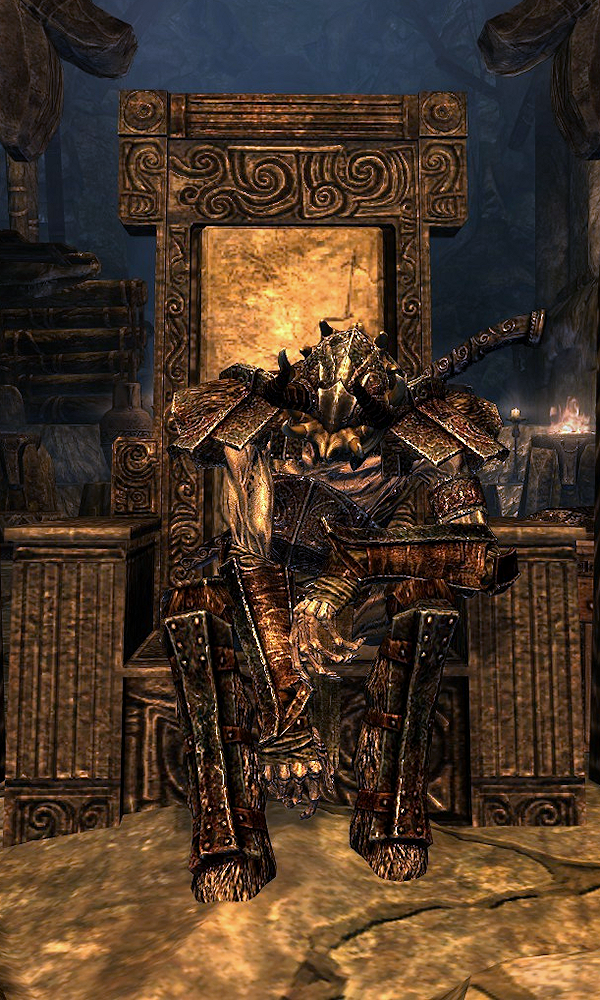
| Prev: Archive 4 | Up: Featured Images/Past Nominations | Next: Archive 6 |